
Fly UX: Increasing Bookings by Simplifying Booking Process (UX)
Outcome
Redesigned the flight-booking process for a startup airline, removing key usability bottlenecks that caused user hesitation and stress.
After prototyping and testing, participants completed bookings smoothly and described the flow as intuitive and friction-free.
Role: UX Designer | Tools: Sketch, Miro | Duration: 12 Weeks | UX Diploma Project
Project Overview
The airline wanted a booking flow that felt fast, intuitive, and anxiety-free.
The challenge was to fix the usability issues common to existing airline websites and create a booking experience that supported confident, low-stress decisions from search to payment.
Understanding the Problem
Competitive Benchmarking
I analysed four major airline websites, focusing on homepages, search functions, and fare-selection flows.
To visualise findings, I created a benchmark document with annotated screenshots — green dots for strengths, red for weaknesses.
Key Insights
Clean, ad-free homepages were easier to scan.
Flight search should encourage discovery, not just text input.
Missing calendar availability slowed decisions.
Overview sliders made fare comparison clearer.
Many interactive elements looked static, leading to frustration and drop-offs.
This made the design goal clear: keep it clean, discoverable, and unmistakably interactive.
Learning from Real Travellers
Usability Testing
I ran two live usability tests and reviewed two additional sessions provided by the UX Design Institute.
Lockdown made participant recruitment difficult, so I tested with frequent flyers among friends — a limitation I documented openly. Each was asked to search and book a flight, choosing their own fare and baggage options.
I observed their behaviour, asked clarifying questions, and later analysed time-stamped recordings.
Observing participants confirmed that booking flights often felt stressful and confusing — validating my own experience and reinforcing that this was a widespread usability issue, not a personal frustration.
Findings
Even experienced users struggled with search and fare selection.
Calls-to-action were unclear; several didn’t realise they had to choose a fare.
Ambiguous buttons created hesitation.
Booking clearly caused stress, showing the issue wasn’t individual but systemic.
Organising the Data
Affinity Diagram
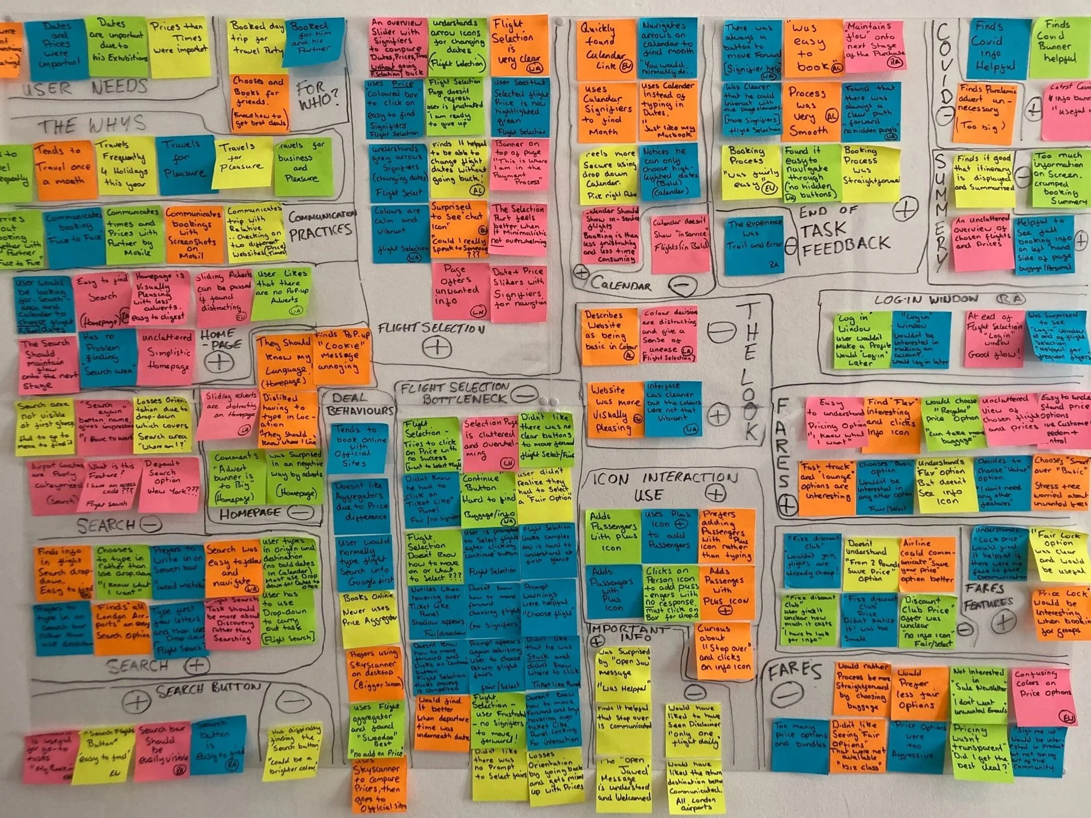
To make sense of the research, I grouped notes from benchmarking and testing into an Affinity Diagram.
Patterns quickly emerged, revealing where users stalled or grew uncertain.
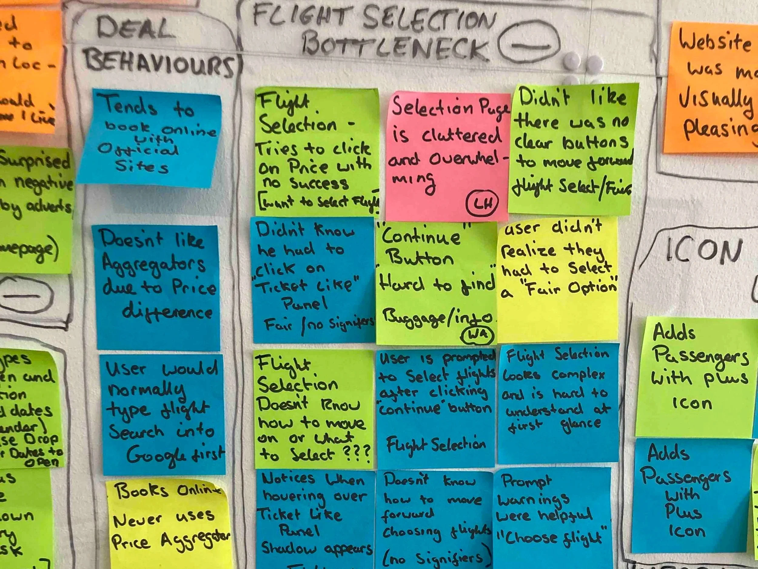
Pain Points Identified
Typing search inputs led to errors.
The Choose Fare page lacked clear calls-to-action.
Interactive elements weren’t recognisable as interactive.
The flight-selection page felt overwhelming.
Many booked a basic fare first and added extras later.
We labelled the recurring issue “Bottleneck” — the point where users most often hesitated. Fixing this became the top priority.
Mapping the Experience
Customer Journey Map
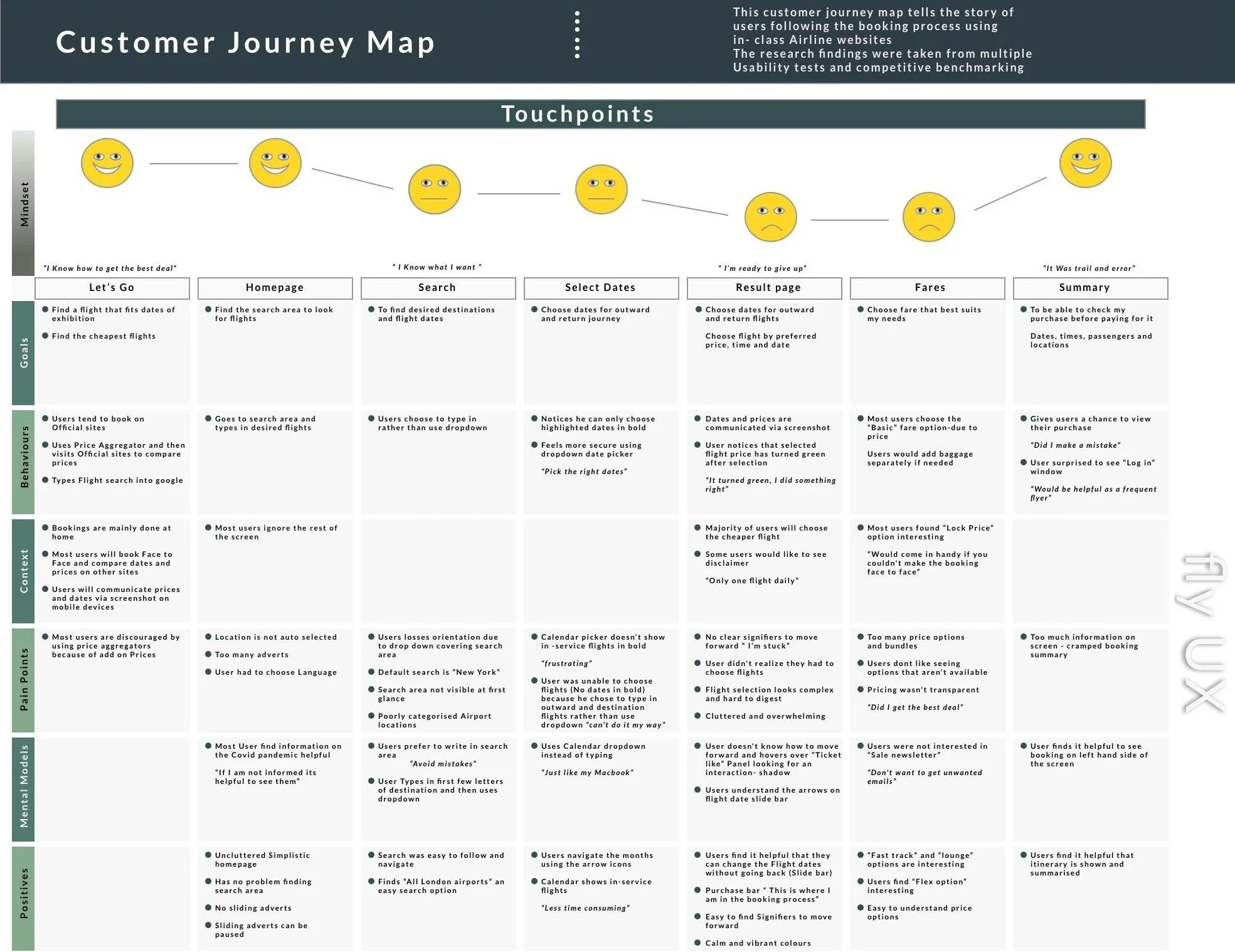
I mapped the journey from search to payment, linking each step to user goals, pain points, and positive moments.
Smiley-face icons quickly conveyed emotional tone, making the map easy to scan.
Conflicting data from the Affinity Diagram was balanced by adding a “positive” row to show what already worked well.
Including user quotes grounded the insights in reality and helped communicate empathy to mentors and stakeholders.
Designing Solutions
User Flow
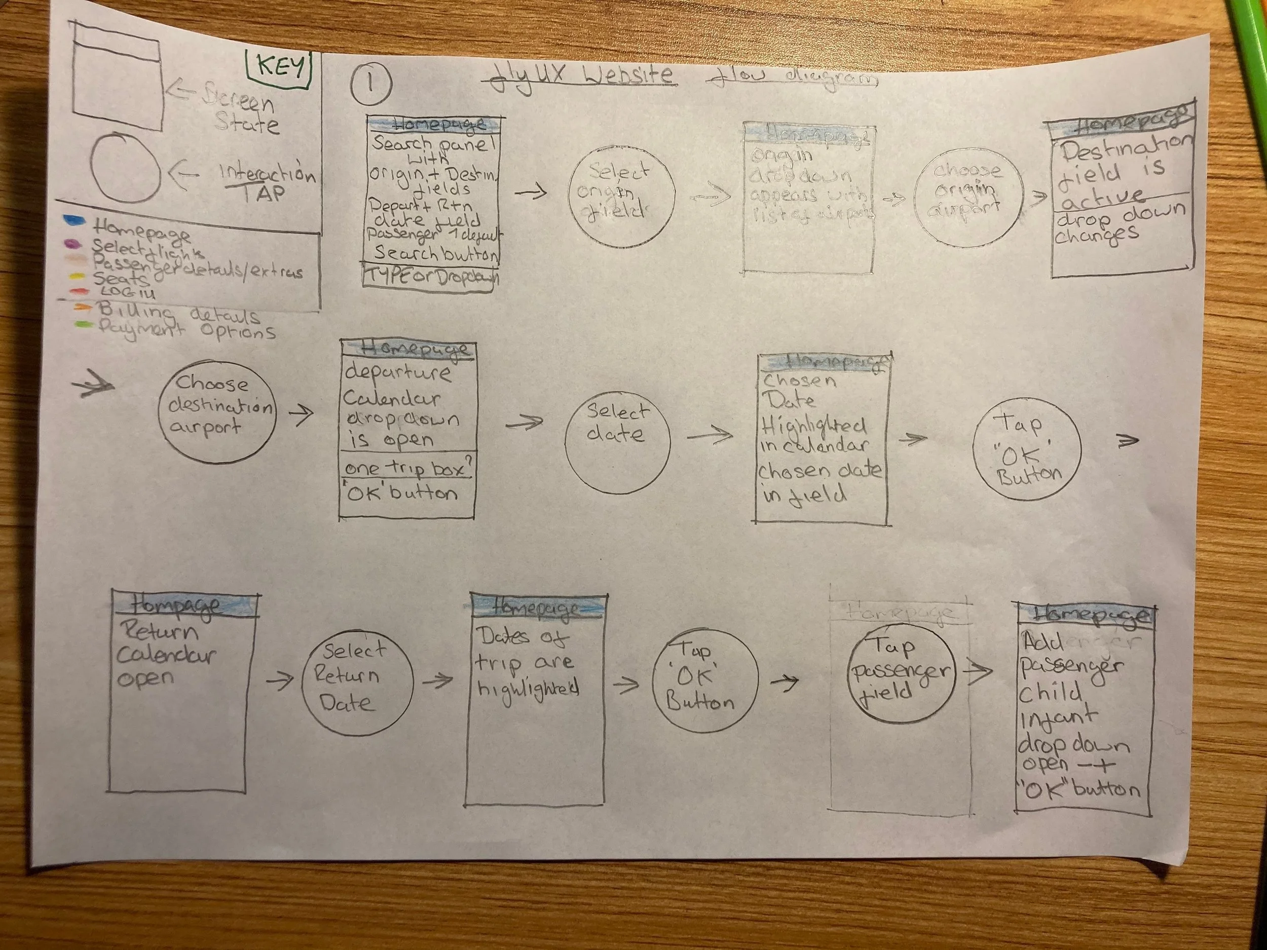
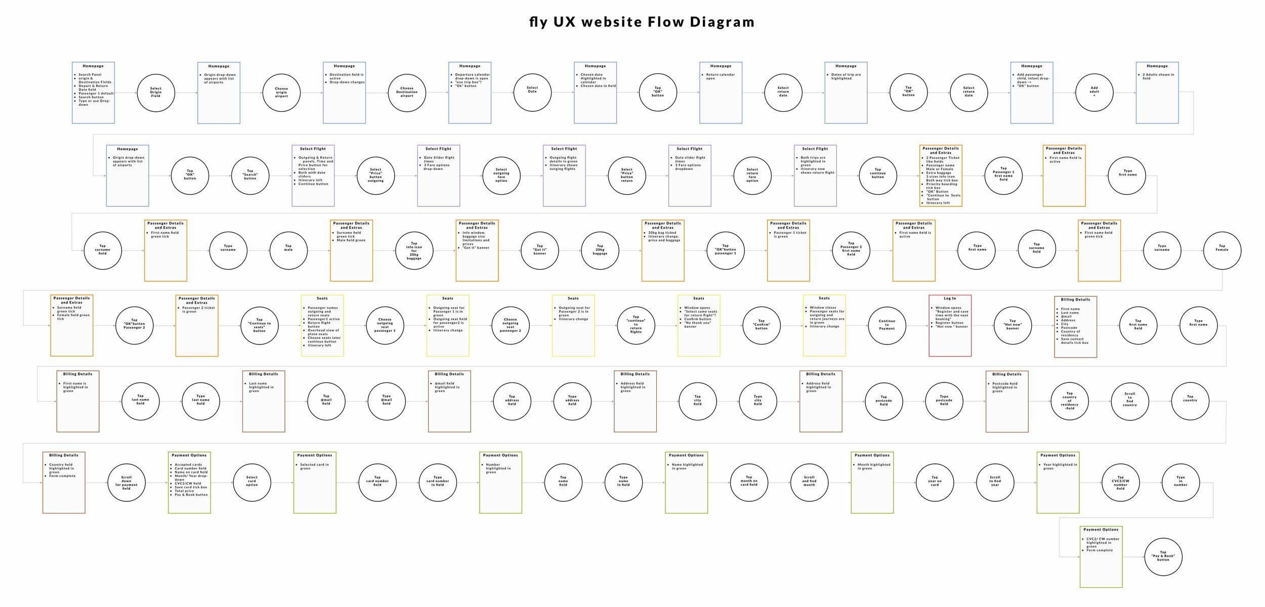
Using the best-performing competitor site as a structural reference, I mapped an optimised flow and explored variations by booking flights for two people.
Key Improvements
Search Field: Allow both typing and dropdown selection; include autocorrect.
Results Page: Add clear, consistent calls-to-action.
Fare Selection: Let basic-fare users add baggage or priority boarding while entering passenger details.
Forms: Provide inline validation and simple, visible error messages.
These updates were designed to keep momentum high and prevent points of hesitation throughout the booking journey..
From Sketches to Prototype
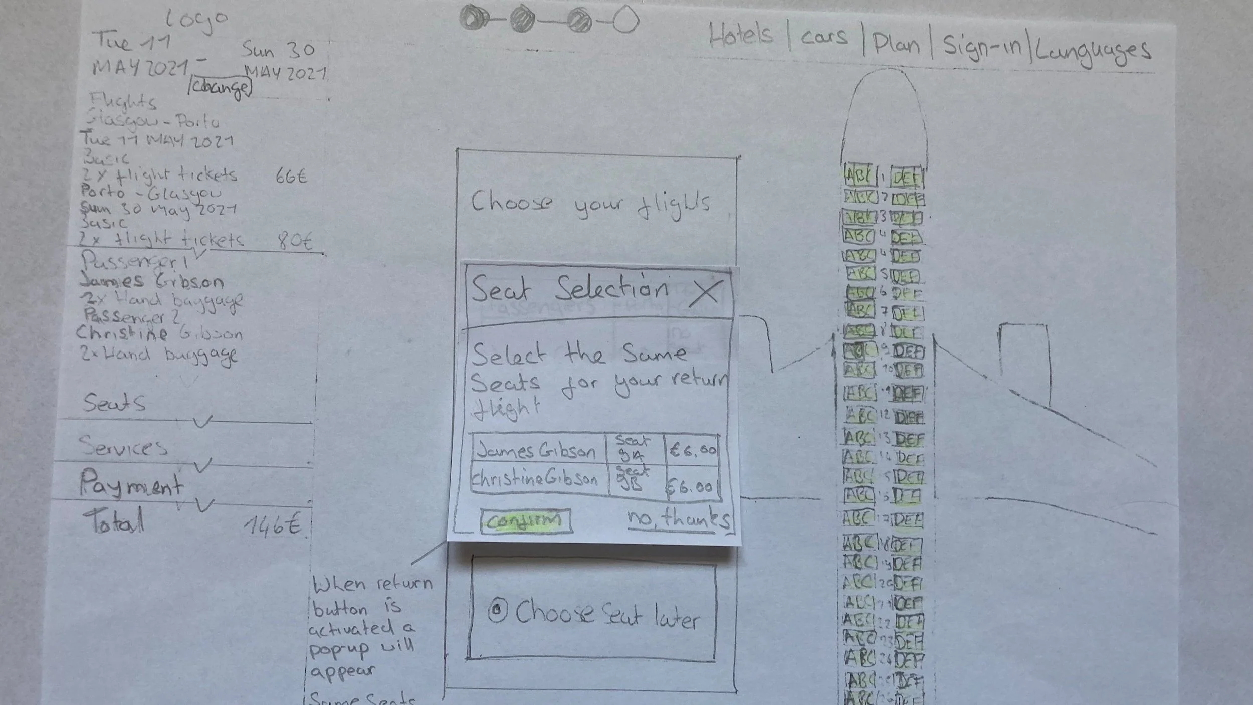
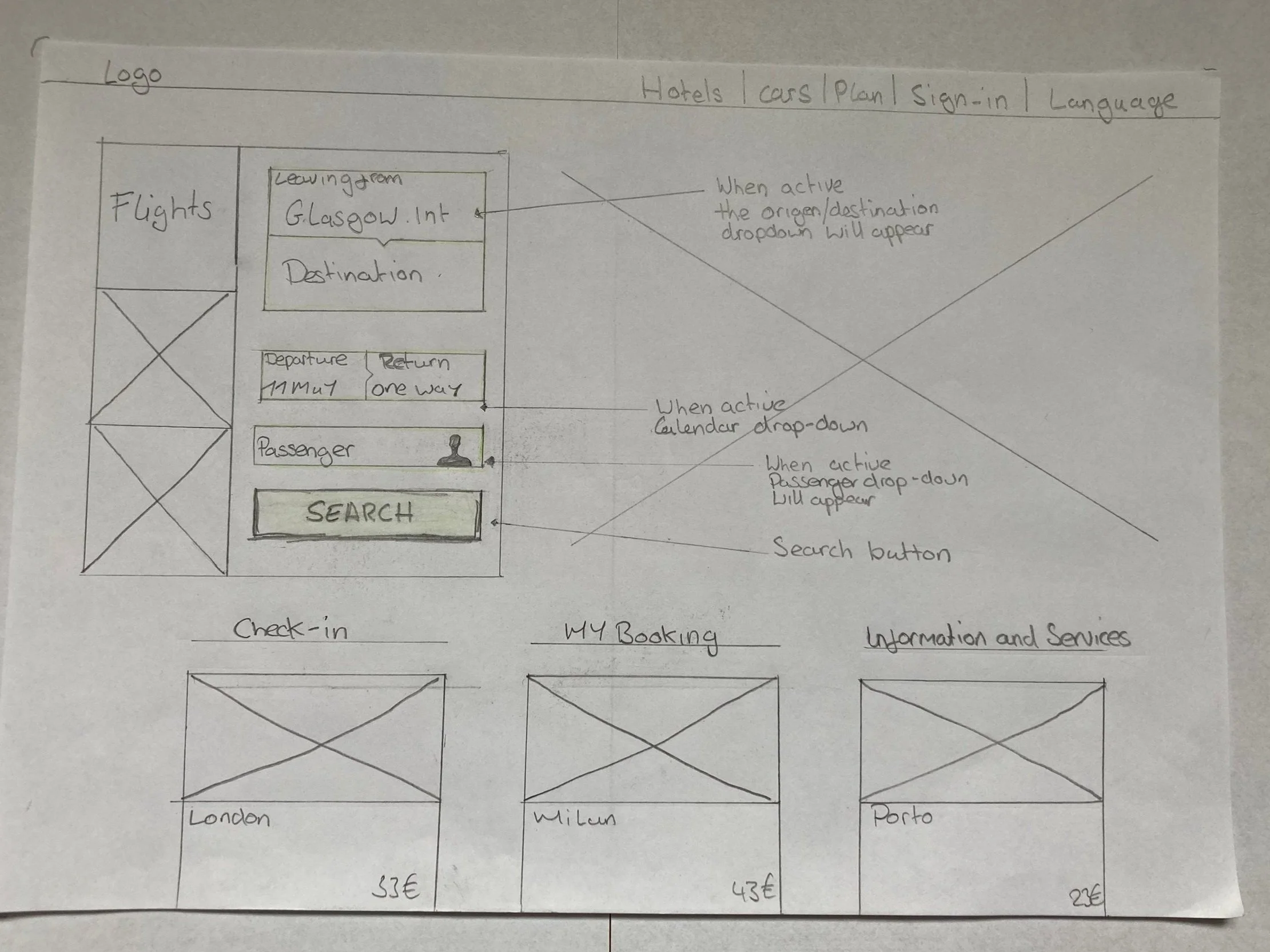
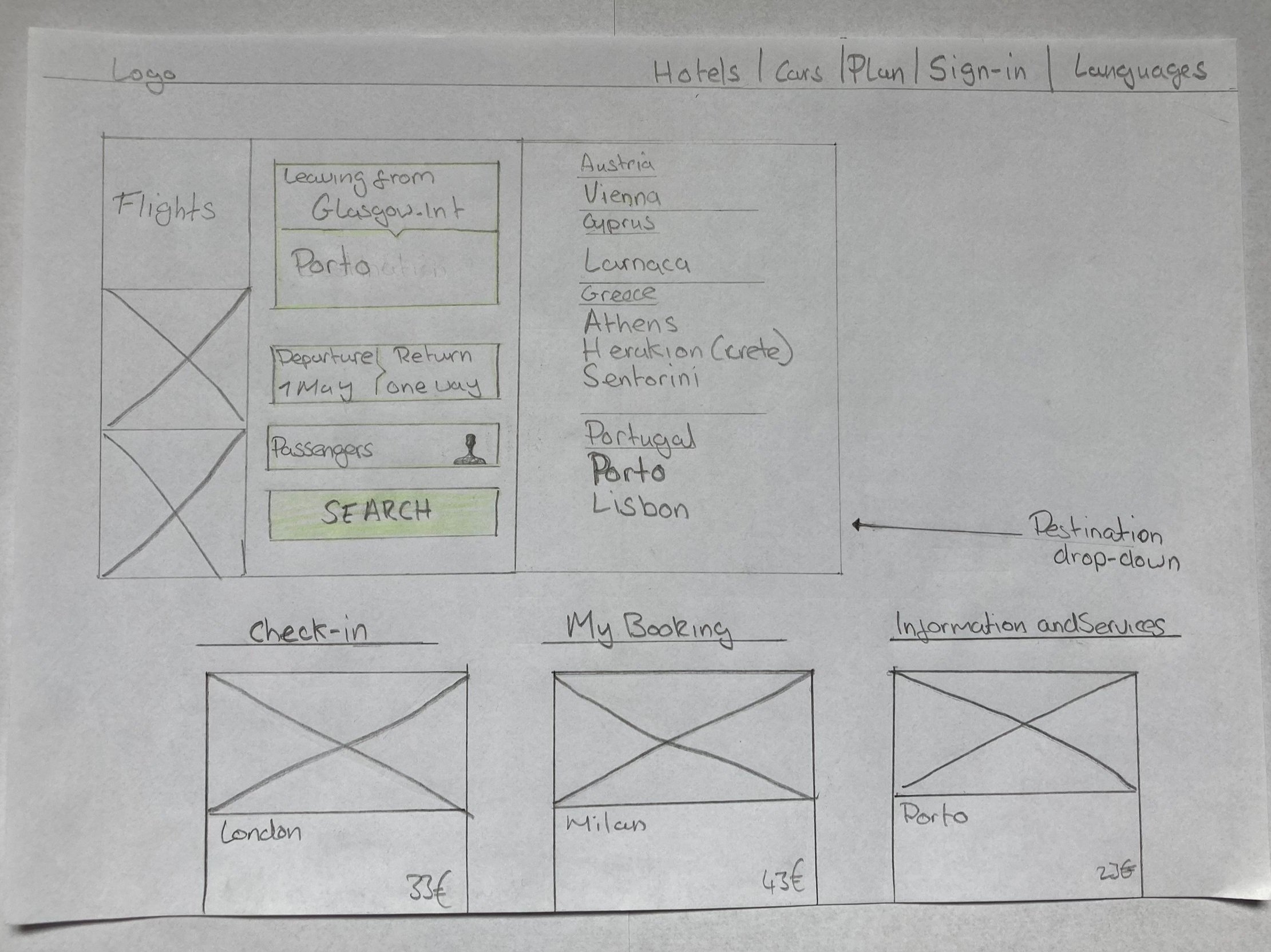
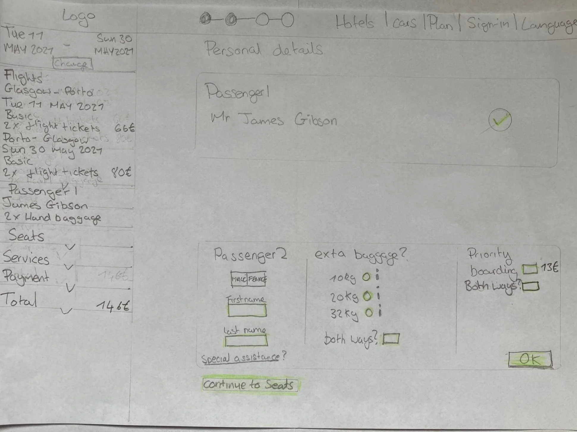
Sketching Critical Screens
Before building the prototype, I sketched each main screen and its possible states.
Drawing first removed guesswork later and ensured the structure matched real-world use.
Focus Areas
Consistent inline validation to maintain confidence.
Add-ons integrated directly into the passenger-details step.
Peer feedback with mentors and classmates to catch logic gaps early.
Testing the Prototype
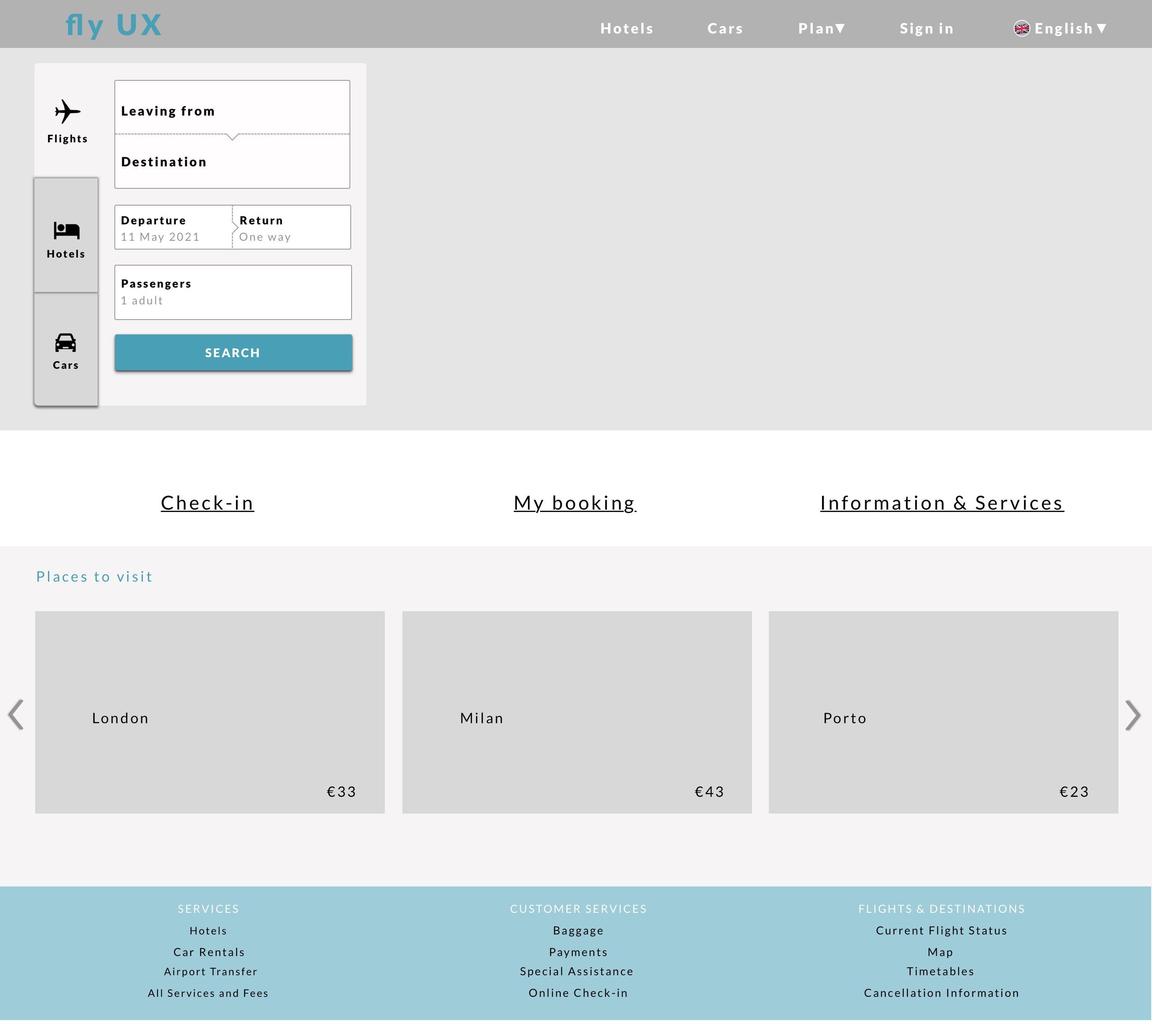
Desktop Prototype Evaluation
The interactive prototype covered the full booking flow from search to payment and was tested with three users.
Results
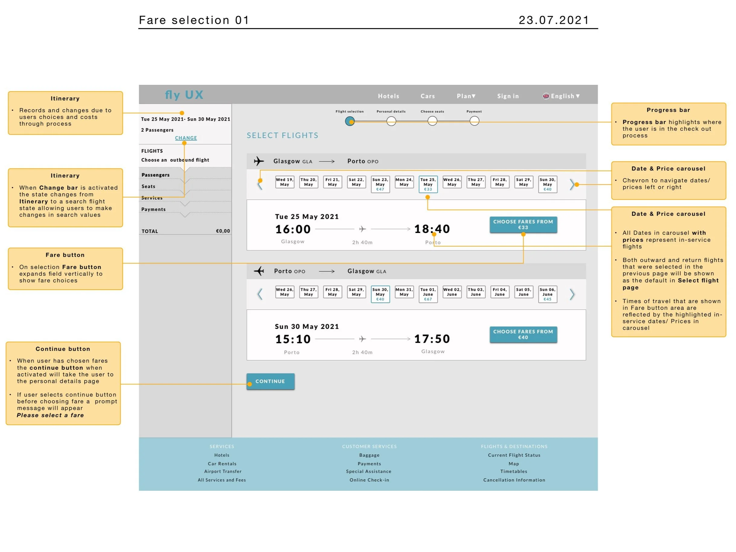
The “Choose Fare” button was immediately visible and understood.
Adding baggage within passenger details felt convenient.
All participants completed the process without friction.
Feedback described the experience as easy to follow and intuitive.
Testing confirmed that clearer calls-to-action and contextual options eased user stress and improved flow.
Communicating the Design
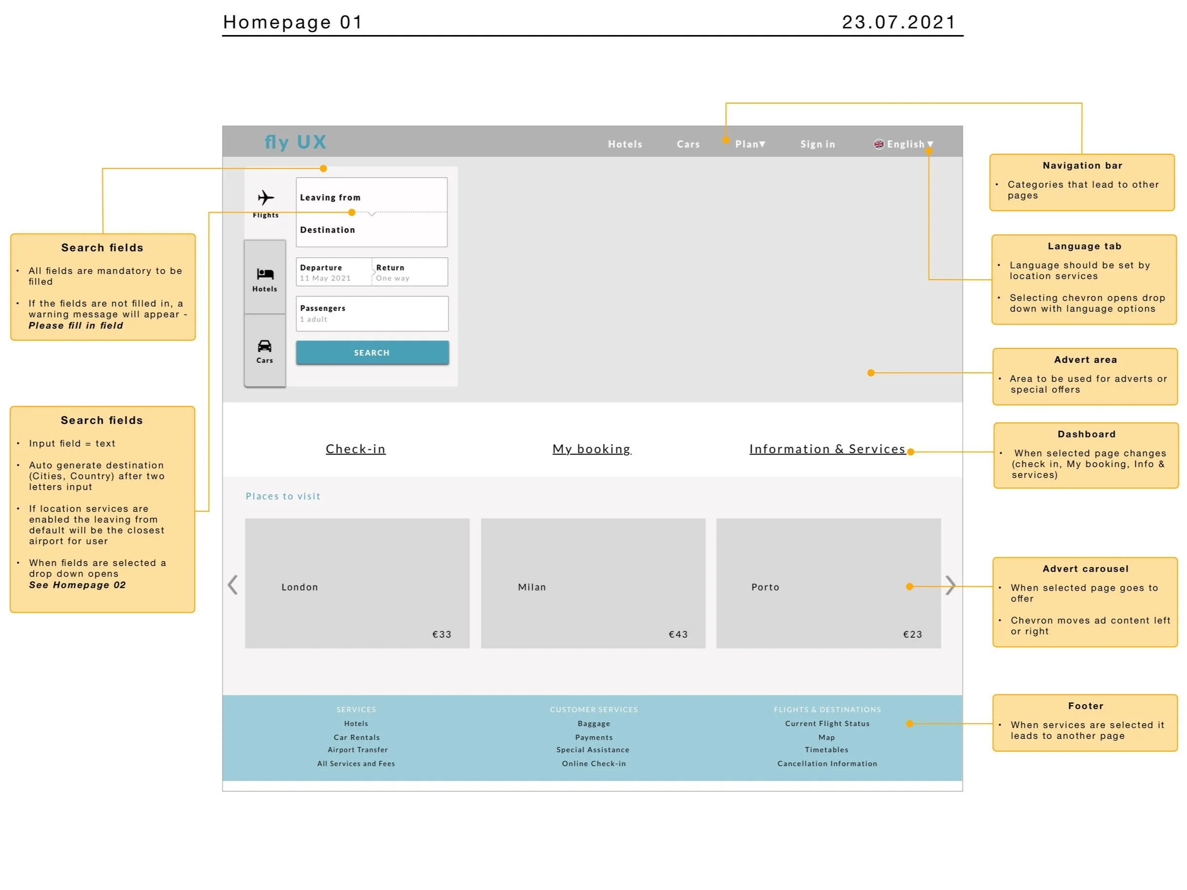
Wireframes for Handoff
After validation, I refined the wireframes for developer communication. One key improvement addressed a limitation the prototype couldn’t test: ensuring the search input used autocorrect for typed city names — a known cause of user errors.
Outcome & Reflection
The final concept created a calmer, more intuitive booking journey by clarifying interactions and integrating options logically.
Testing showed that travellers could complete bookings confidently, without the hesitation seen in initial studies.
What I learned: Even small, focused usability fixes — clearer CTAs, inline feedback, predictable patterns — can remove major friction and turn a stressful task into a seamless one.
More Case Studies
HEALTH CARE UX
Increasing Intravacc Lead Generation With Website Relaunch
Working with the team, we used OOUX, competitive analysis, and wireframing to redesign Intravacc's website from research-centric to customer-centric, delivering a stakeholder-approved prototype ready for UI development.
6 minute read
COMMUNITY PLATFORM OOUX
From Frustration To Flow: Structuring A Neighbourhood Parking App
Applied OOUX and the ORCA process to map the core objects, relationships, and actions of a neighbourhood parking app, delivering a clear system foundation that reduced complexity before a single screen was designed.
8-minute read