
From Frustration to Flow: Structuring a Neighbourhood Parking App with OOUX
Outcome
Using Object Oriented UX, I explored how neighbours in my local area could share temporary parking availability in a simple, low-effort, and community-focused way.
Through object mapping and ORCA (Objects, Relationships, Calls-to-Action, Attributes), the project clarified the system’s key objects, actions, and relationships early in the discovery process, creating a stronger foundation for future UX and product design decisions.
Role: UX Designer | Tools: whimsical | Duration: 3 Weeks | Methodology: Object-Oriented UX (OOUX)
Project Overview
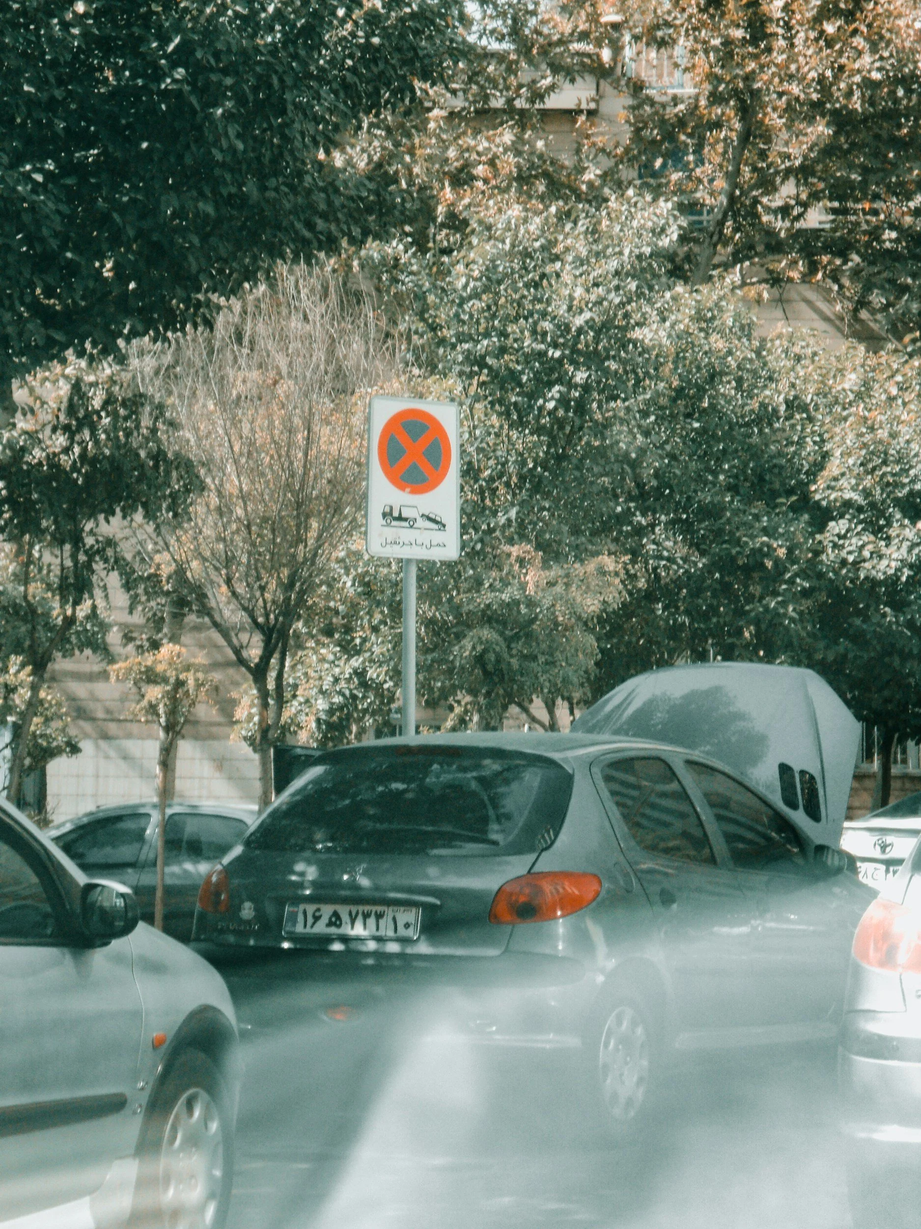
Parking in my neighbourhood can be difficult, especially during busy evenings. At the same time, parking opportunities constantly appear as residents leave, but nearby neighbours often have no way of knowing about them.
This project explores how a lightweight app could help neighbours let other neighbours know where a parking opportunity might be a simple heads-up that could reduce searching, time, and frustration without turning parking into a booking or reservation system.
Framing a Local Parking Coordination Problem
Parking in my neighbourhood can be difficult, especially during evenings and weekends. Residents often circle the same streets repeatedly searching for a space, leading to:
wasted time,
increased fuel consumption,
unnecessary noise,
local congestion,
and growing frustration among neighbours.
At the same time, parking spaces regularly become available when residents leave the area. These temporary opportunities often go unnoticed by neighbours who are actively searching nearby.
One question stood out:
Could neighbours help each other find parking without creating a complicated booking system?
That question became the foundation for the project.
Exploring How Neighbours Could Coordinate Parking More Easily
To explore possible solutions, I reviewed local reporting on parking challenges in Ölberg and Nordstadt, examined emerging parking management initiatives, and used exploratory stakeholder prompts to better understand different perspectives.
A few important insights emerged:
The issue wasn't simply a lack of parking spaces, but how existing spaces were being used and shared.
Local discussions emphasized the need for neighbourhood-focused solutions rather than unrestricted access.
Trust and fairness would be essential if residents were expected to help one another.
Any solution would need to remain lightweight and easy to participate in.
These insights helped define the scope of the project and informed several early decisions, including neighbourhood verification and a focus on sharing availability rather than creating a formal reservation system.
Identifying the Core Objects Behind the System
With a clearer understanding of the problem space, I moved into object discovery. Rather than jumping straight into features or screens, I used noun foraging to uncover the key concepts people were already using when talking about parking in the neighbourhood.
I reviewed local newspaper articles, parking management discussions, and exploratory stakeholder prompts, looking for nouns that appeared repeatedly and seemed central to the problem.
Noun Foraging
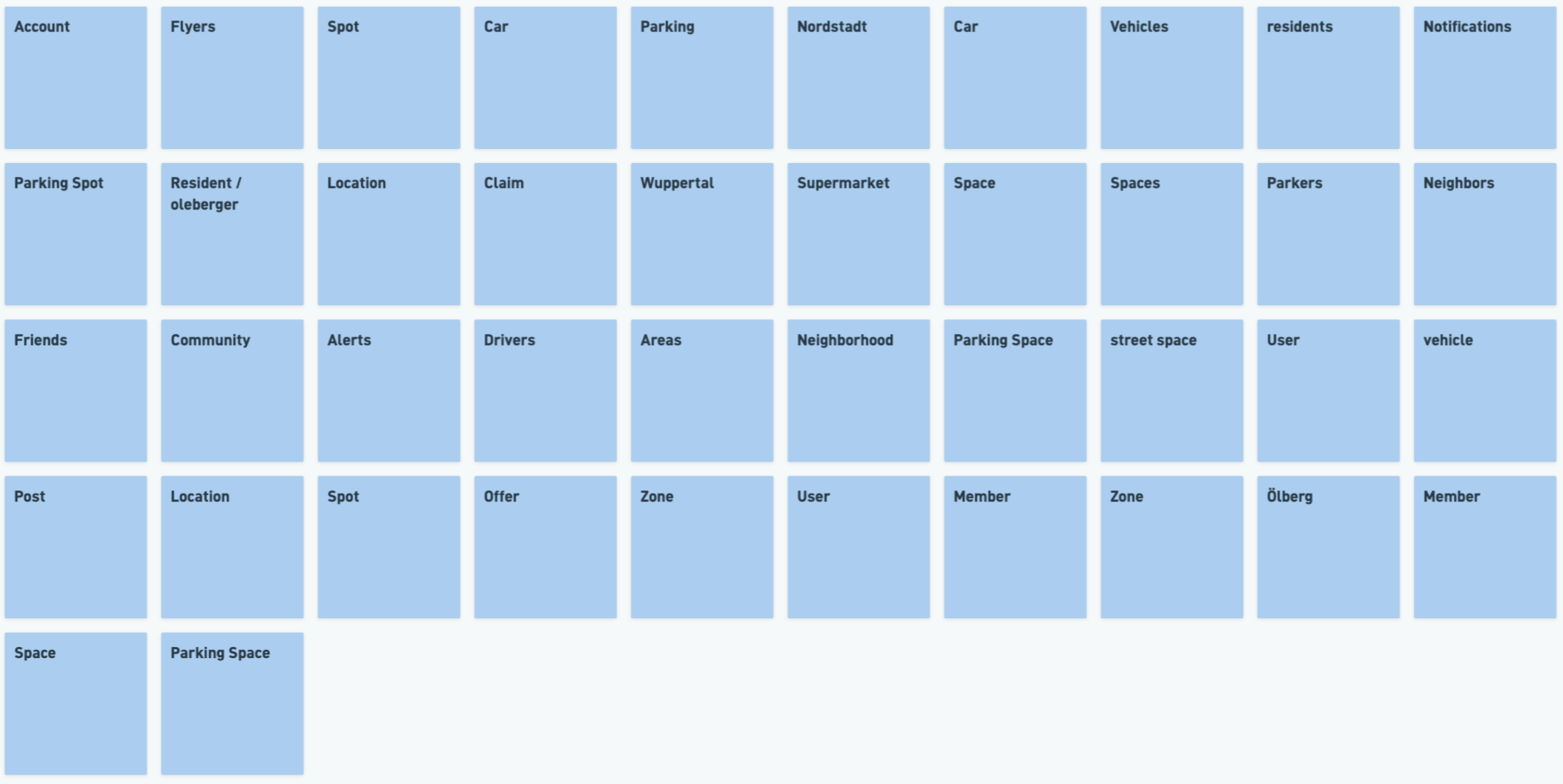
Nouns gathered from local news articles, parking management discussions, and exploratory stakeholder prompts.
The initial noun list included a mix of people, places, and parking-related concepts. While many nouns appeared throughout the research, not all of them represented meaningful objects within the system.
Using the SIP test (Structure, Instances, Purpose), I evaluated which nouns represented valuable, real-world concepts that users would need to understand and interact with.
Object Discovery
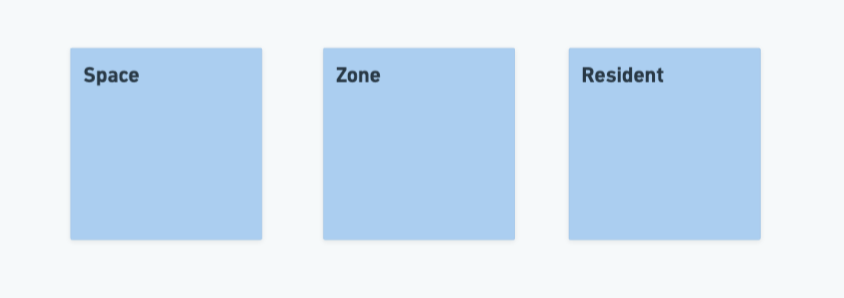
After filtering and refining the noun list, three core objects emerged.
The discovery process ultimately revealed three core objects:
Resident – a verified member of the local neighbourhood
Zone – a defined community area where residents interact
Space – a parking space that can become temporarily available
These objects formed the foundation of the system and helped keep the concept focused on neighbourhood coordination rather than creating a complex parking management platform.
Mapping Relationships to Clarify How the System Works
Once the core objects were defined, I mapped the relationships between them using a Nested Object Matrix (NOM).
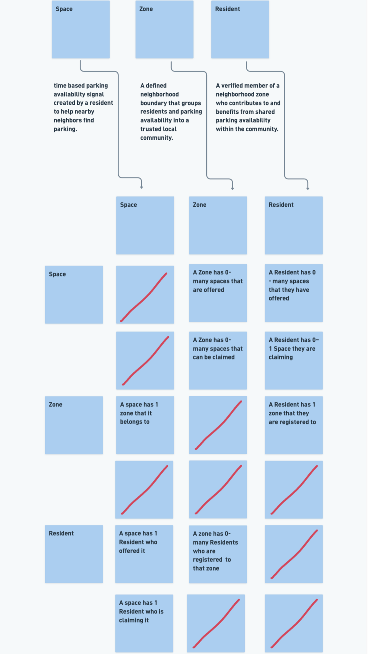
This exercise surfaced important assumptions about how the objects interacted and helped transform a simple idea into a more clearly defined system.
For example:
A Space exists within a Zone and can be shared with nearby Residents.
A Zone contains multiple Spaces and Residents.
A Resident belongs to a Zone and can interact with multiple Spaces.
Because this was intentionally designed as a lightweight neighbourhood app, the relationship model remained relatively simple. Unlike larger enterprise systems with dozens of interconnected objects, the focus here was on establishing only the relationships needed to support local parking coordination.
These relationships helped reinforce the idea of a neighbourhood-based system built around local awareness and community trust.
Defining Actions That Support Neighbourhood Coordination
With the core objects and relationships established, I explored the actions available to each object.
To do this, I reviewed existing parking apps and asked:
What would a resident want to do with this object?
Using a CTA Matrix, I mapped the actions associated with Spaces, Residents, and Zones.
CTA Discovery
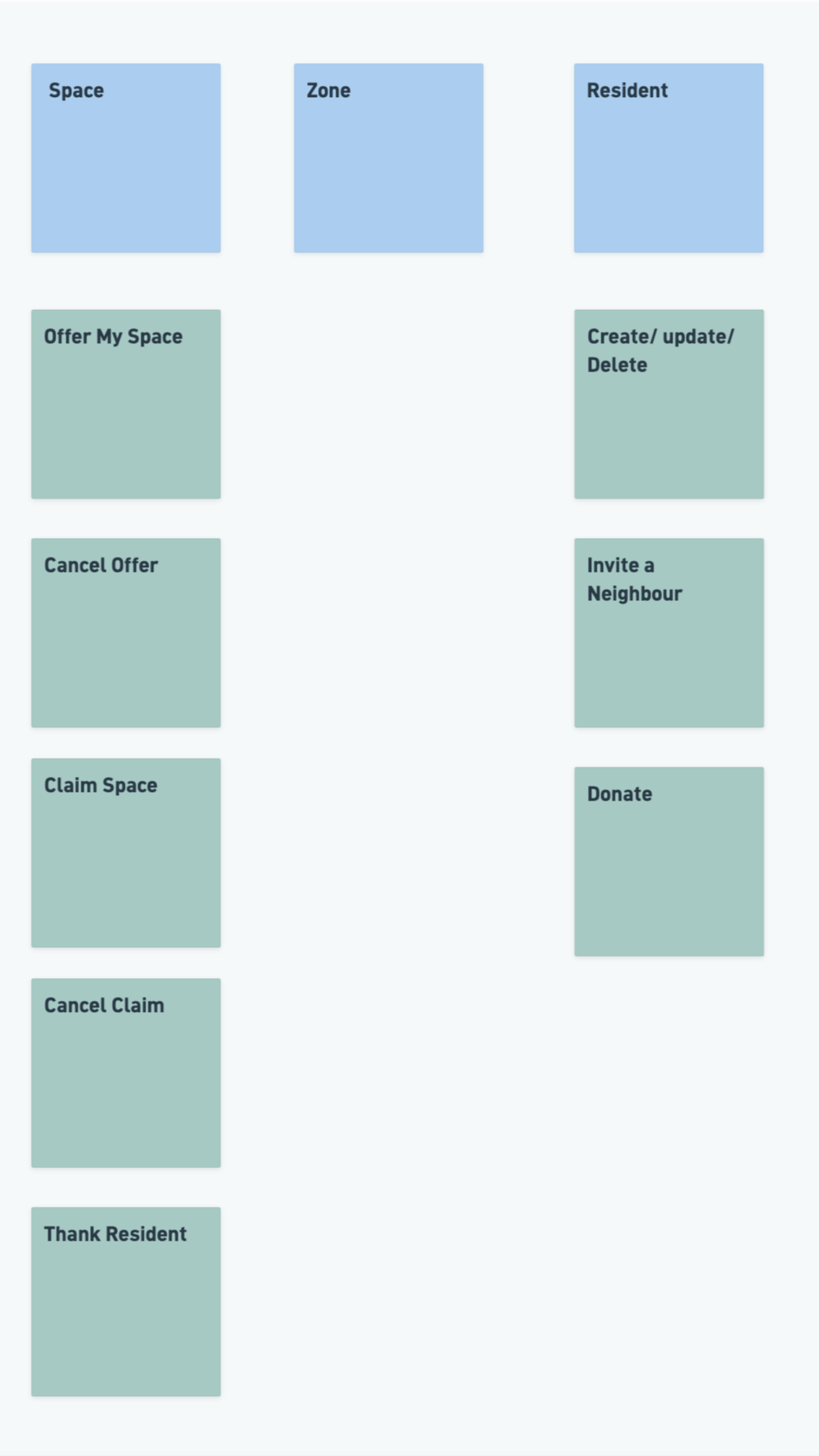
Mapping actions to the system's core objects.
Most actions centred around the Space object, including offering, claiming, and cancelling parking availability. Additional actions such as inviting neighbours, managing a profile, and thanking residents helped support community participation.
One interesting insight was that Thank Resident naturally emerged from interactions with a claimed space, reinforcing the importance of attaching actions to the object that triggers them.
Identifying the Information Needed to Support Each Object
With the core objects, relationships, and actions established, I explored the information needed to support each object.
Using an Attribute Matrix, I identified the content residents would need to understand and interact with Spaces, Zones, and other Residents.
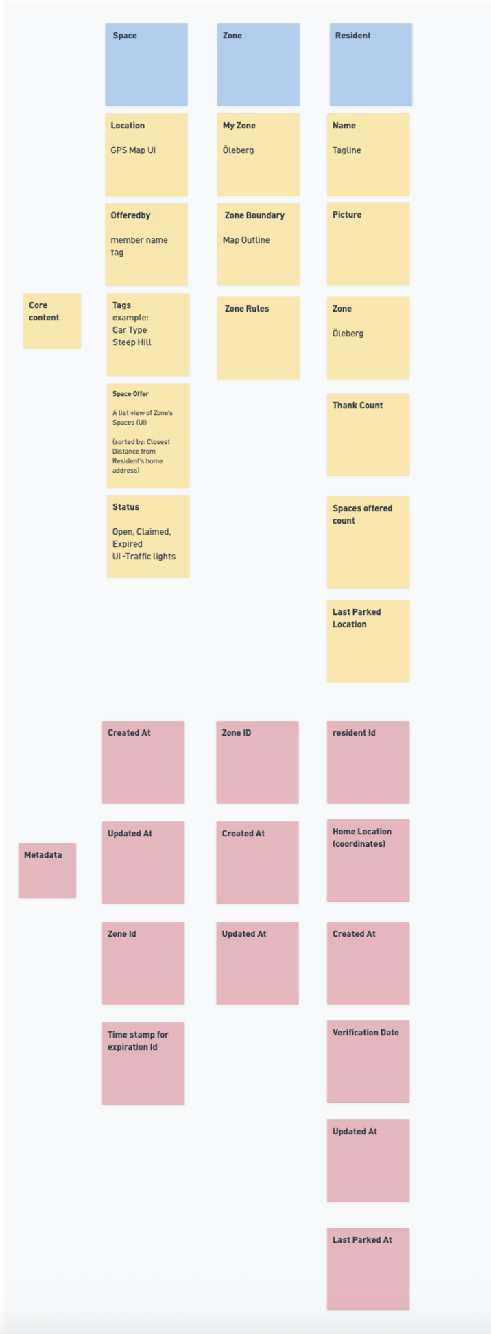
Separating core content from supporting metadata.
One useful outcome of this exercise was distinguishing between information that helps users make decisions and information that exists primarily to support the system.
Bringing the System Together Through Object Mapping
After completing the ORCA process, I combined the objects, relationships, actions, and attributes into a single object map.
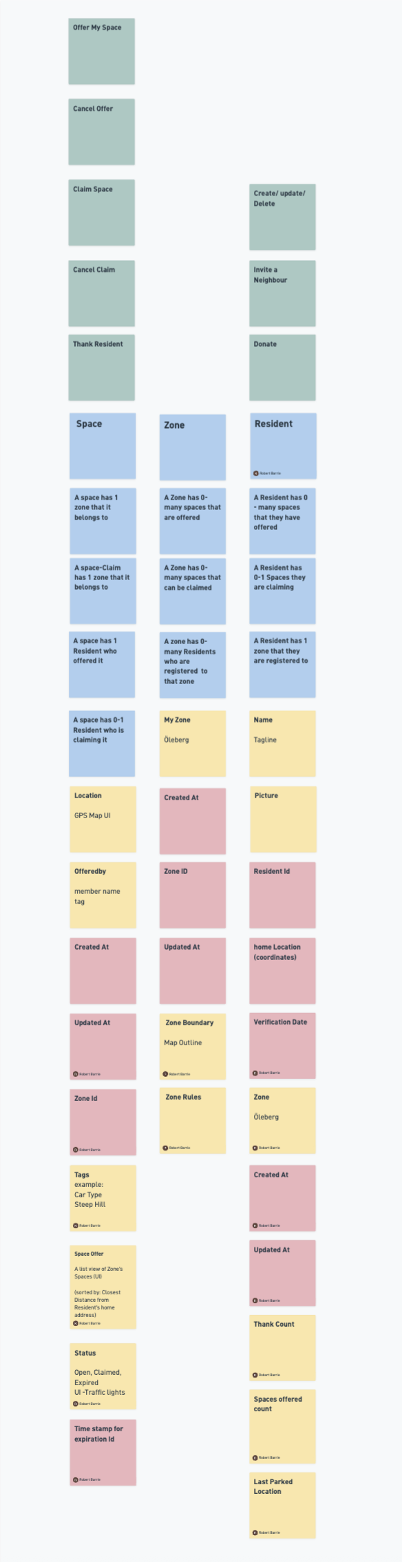
Final object map combining the system's objects, relationships, actions, and attributes.
The object map acted as a structural prototype of the system, allowing me to explore how residents, spaces, and zones would work together before investing time in detailed interface design.
By bringing all elements together in one place, it became easier to identify gaps, validate assumptions, and test whether the concept remained lightweight and community-focused.
The final object map also served as a reference point for early flows, sketches, and future design decisions.
Exploring AI-Assisted Interface Concepts
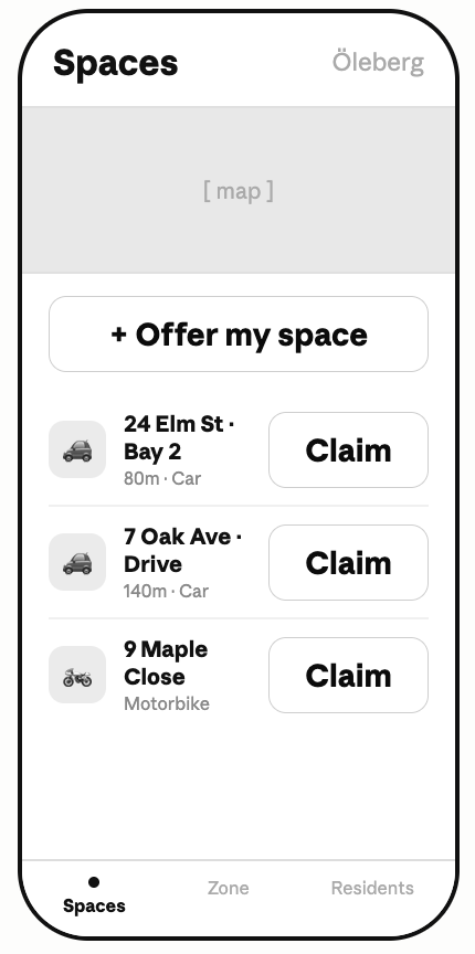
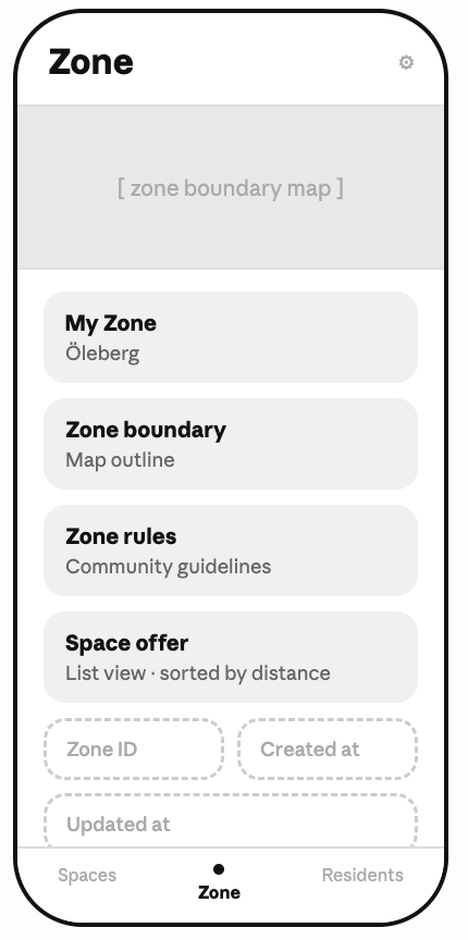
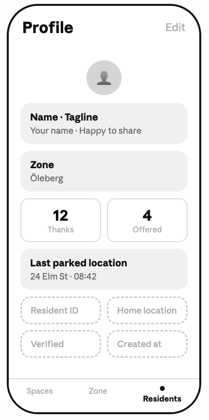
With the object map complete, I wanted to test whether it contained enough structure to support interface design. As an experiment, I shared the object map with Claude and asked it to generate a set of initial wireframe concepts based solely on the objects, relationships, actions, and attributes.
The resulting concepts weren't intended as final designs. Instead, they served as a way to validate the object model, revealing whether the system translated naturally into user interfaces and highlighting areas that could be refined before moving into higher-fidelity design.
Outcome & Reflection
The project resulted in a structured object model that clarified how residents, spaces, and zones work together to support neighbourhood parking coordination. By investing in the discovery phase and applying the ORCA process, I established a clear foundation for future interaction design and product development before creating any interfaces.
What I learned: Designing the system during discovery before designing the screens leads to clearer decisions, fewer assumptions, and a more intuitive user experience.
More Case Studies
HEALTH CARE UX
Increasing Intravacc Lead Generation With Website Relaunch
Working with the team, we used OOUX, competitive analysis, and wireframing to redesign Intravacc's website from research-centric to customer-centric, delivering a stakeholder-approved prototype ready for UI development.
6 minute read
E-COMMERCE UX
Fly UX: Increasing Bookings by Simplifying Booking Process
Redesigned a startup airline's booking flow using competitive analysis, usability testing, and prototyping, removing key friction points and delivering a validated desktop prototype participants described as intuitive and stress-free.
5-minute read