Increasing Intravacc Lead Generation with Website Relaunch(UX)
Outcome
We redesigned Intravacc’s website and CMS to position the company as a Contract Development and Manufacturing Organization (CDMO) and strengthen lead generation.
The final clickable prototype featured improved navigation, trust-driven homepage content, and mobile-friendly design patterns — all approved by stakeholders for UI implementation.
Role: UX Designer | Company: CC.CONSTRUCT GmbH & Co. KG | Tools: Adobe XD, Miro | Duration: 5 Months (including timeline pauses)
Project Overview
Intravacc wanted to redesign its existing website and CMS to:
Focus on customer needs rather than internal vaccine research
Generate more leads for CDMO services
Position Intravacc as a trusted CDMO partner
Showcase the full range of CDMO capabilities
The challenge was shifting the website’s focus from information sharing to relationship building.
Exploring the Website's Current State: A Post-it Discovery Session
March 2023
To understand the site’s structure, I created a wall of post-its representing every page and content type.
This exercise exposed hidden navigation elements and unclear hierarchy — critical issues we needed to fix to improve usability.
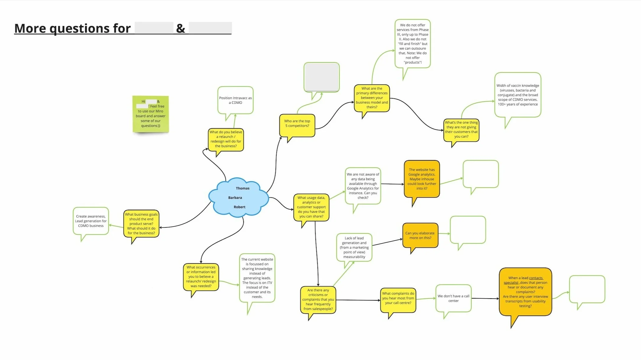
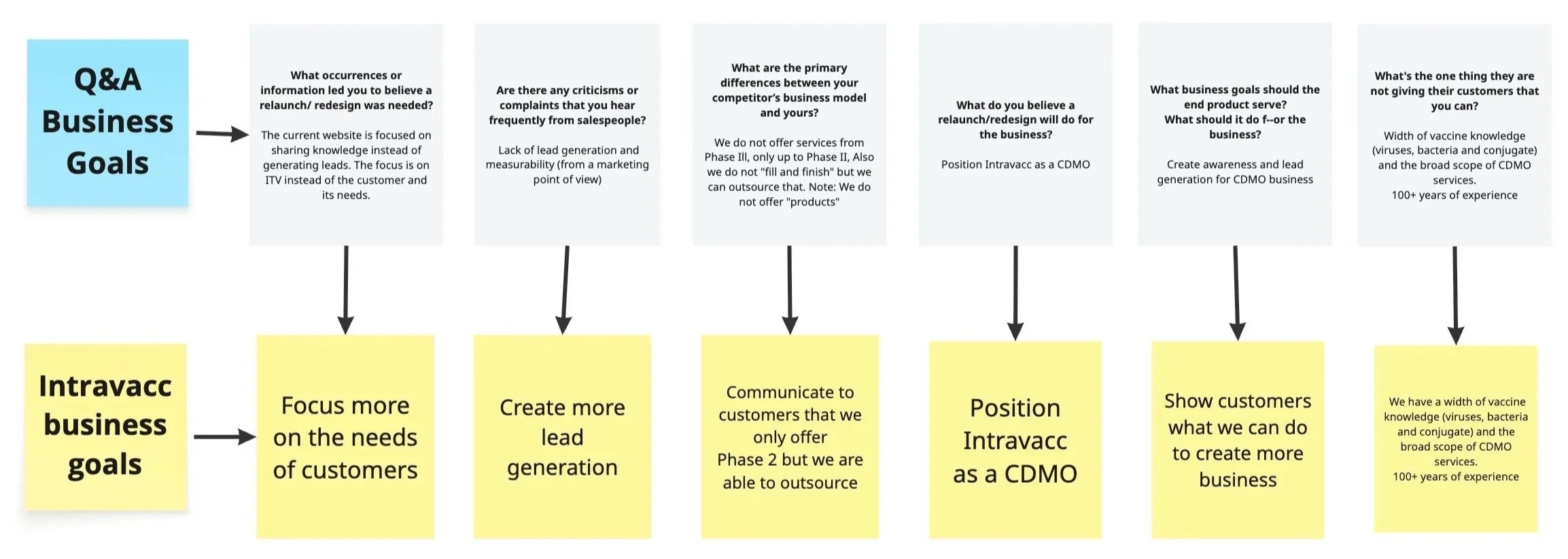
Collaborating with Stakeholders via Miro to Define Business Goals and Guide the Redesign
In our kickoff meeting with the VP of Business Development and Marketing and the Marketing & Communications Manager, we introduced Miro as a shared space to capture goals, pain points, and ideas.
This collaboration clarified the project’s priorities: to build trust, communicate clearly, and drive customer contact.
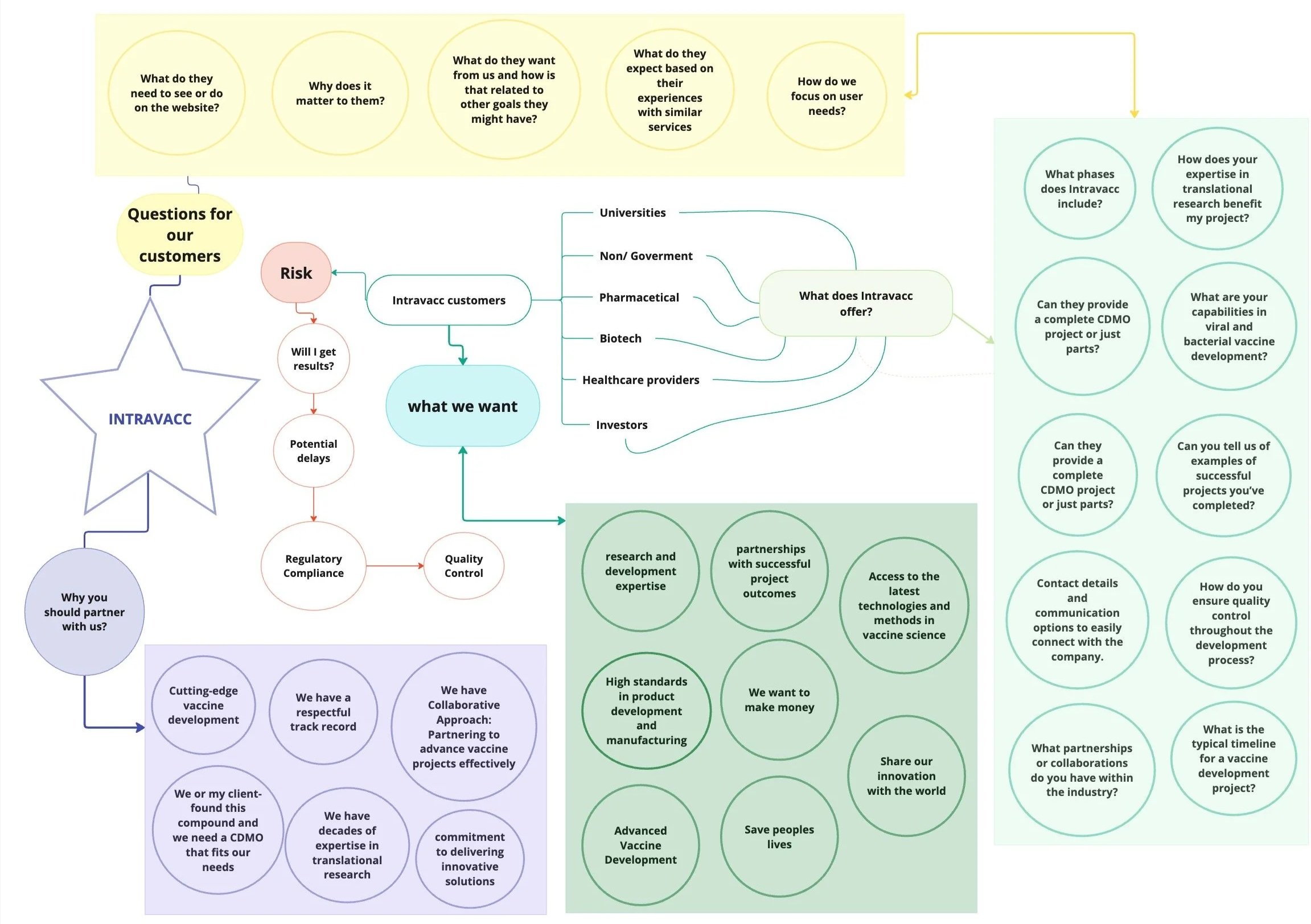
Getting to know a CDMO & their customers with conversations
Understanding a CDMO’s customers was complex — multiple services, diverse clients, technical language.
Without existing personas or user research, we relied on the content writer’s industry experience to uncover user behaviours and goals.
Her insights helped the team understand what potential clients care about and how they evaluate a CDMO partnership.
Understanding how to build trust with customers through podcast research
To strengthen our understanding, I explored CDMO-focused podcasts and articles such as “What to Look for in a CDMO.”
These revealed what customers value most:
Clear descriptions of services and expertise
Evidence of reliability and timely delivery
Consistent quality and safety standards
Easy ways to make contact and start conversations
These takeaways guided our content and structural decisions.
Introducing Emotional Mapping to Spark User-Focused Conversations
During a coffee break, I suggested to the team that an Emotional mapping session could help better understand the users of the site. This was a challenge for the team. But, it was positive because it started a conversation about their views and thoughts on user needs.
I added what I had learned from my research and our conversations on the Miro board and shared it as a mind map.
Improving Intravacc website through competitor analysis
Before kickoff, I reviewed several potential competitor sites. Through stakeholder discussions, we identified five true competitors and analysed their websites for trust signals and user experience patterns.
I compiled a document summarizing how these competitors built credibility and simplified contact. From this, we recommended the following improvements for Intravacc’s site:
Allow customers to book a call directly (e.g., Calendly)
Add persistent vertical links for social, contact, and newsletter sign-ups
Include success stories with people and outcomes
Add an FAQ section to reduce search friction and improve SEO
Display estimated reading times on news articles to create transparency
Stakeholders appreciated the practical recommendations and approved them for inclusion in our wireframes.
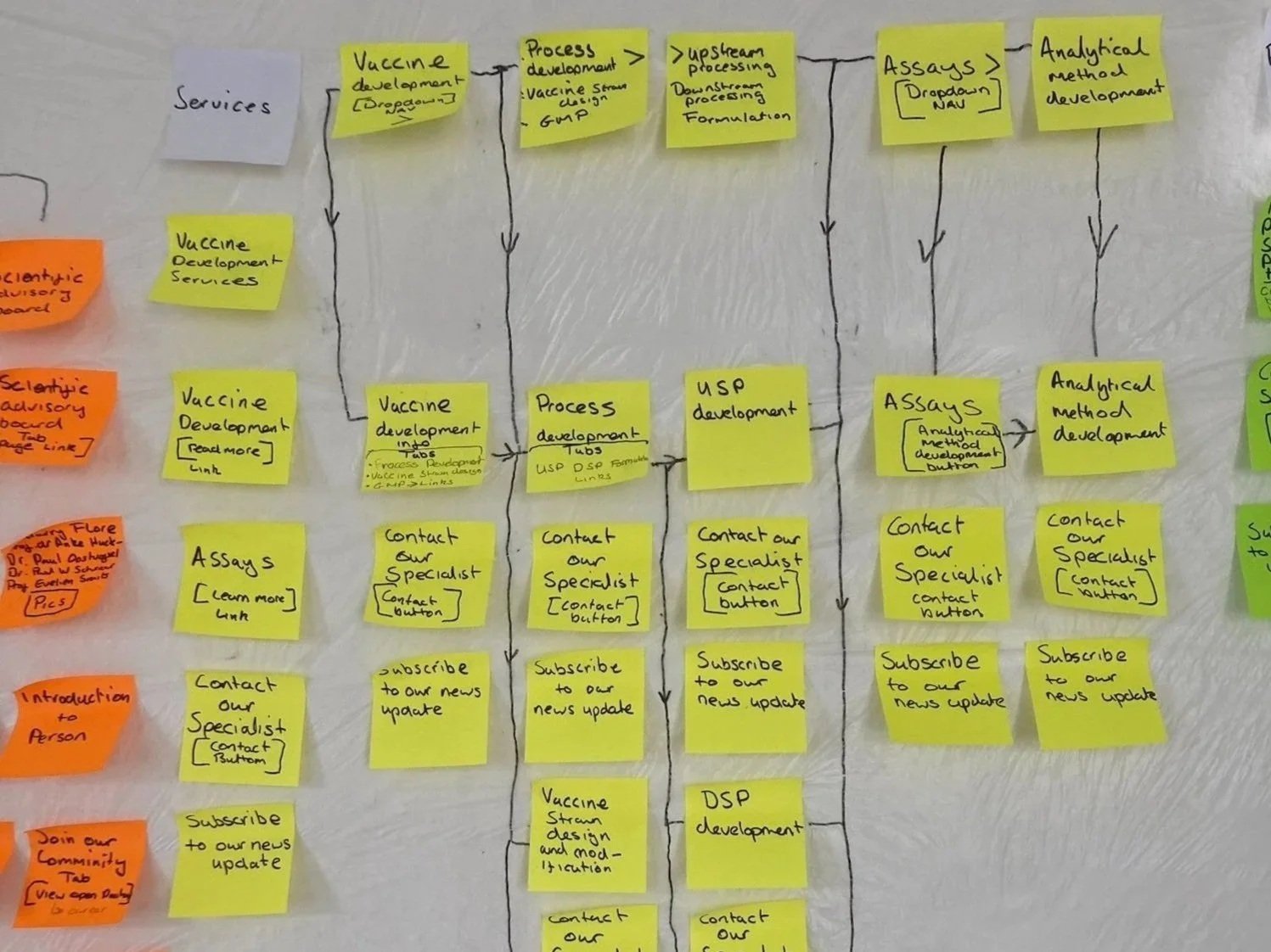
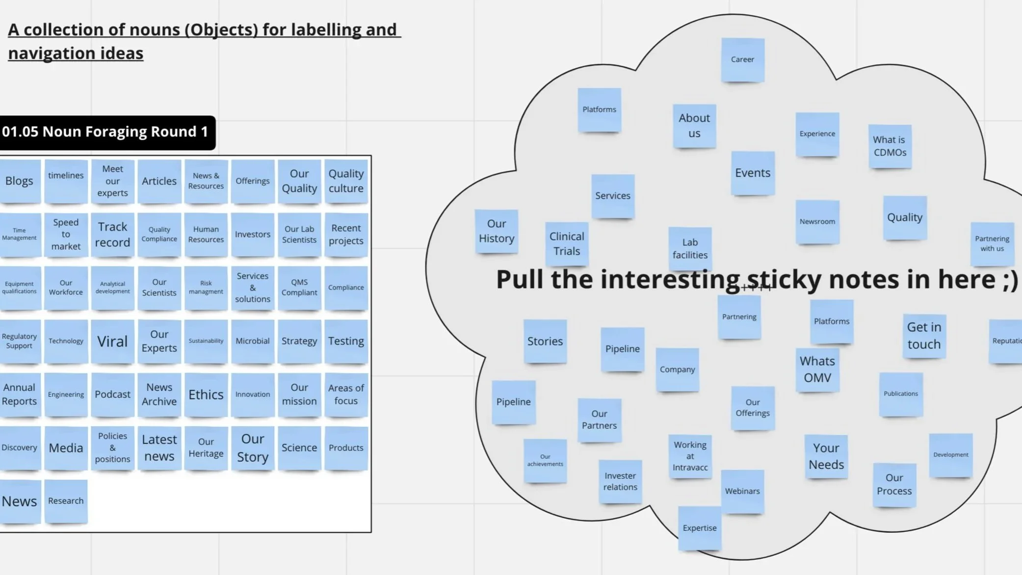
Uncovering stakeholder website labelling preferences through OOUX noun forging
May 2023
Using the existing sitemap in Miro, we identified confusing navigation labels and hidden dropdowns. To simplify and clarify structure, I introduced the noun-forging method from Object-Oriented UX (OOUX).
Stakeholders dragged potential labels (collected from competitor sites) into clusters of preferred terms.
Their chosen language shaped the reorganized navigation implemented in our medium-fidelity wireframes.
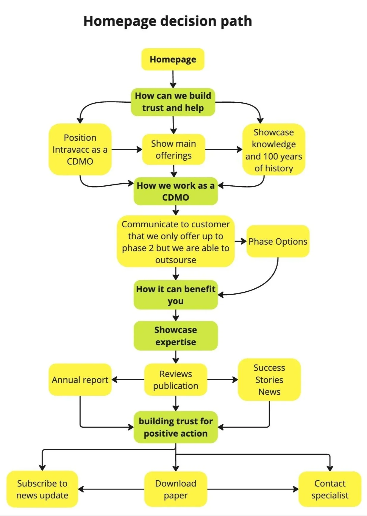
Enhancing CDMO awareness and trust using Research for homepage Decision Path
May 2023
The team used research insights from podcasts and competitor analysis to plan a decision path for the homepage.
This mapped how visitors move from awareness to trust and finally to contact.
We designed the homepage to build credibility first, highlight expertise next, and end with clear calls to action — contacting a specialist or subscribing to the newsletter.
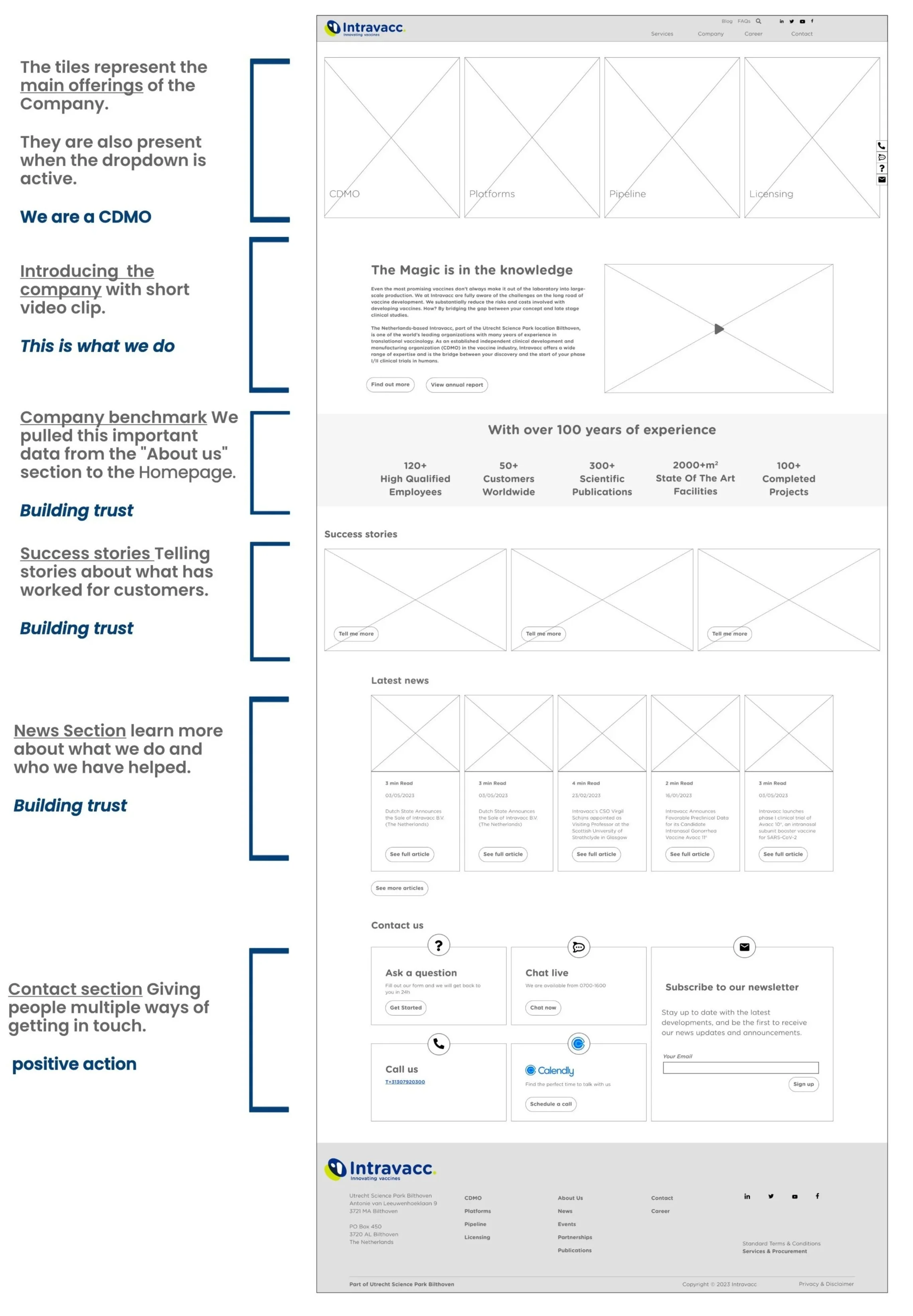
Building the decision path into the Wireframes
June 2023
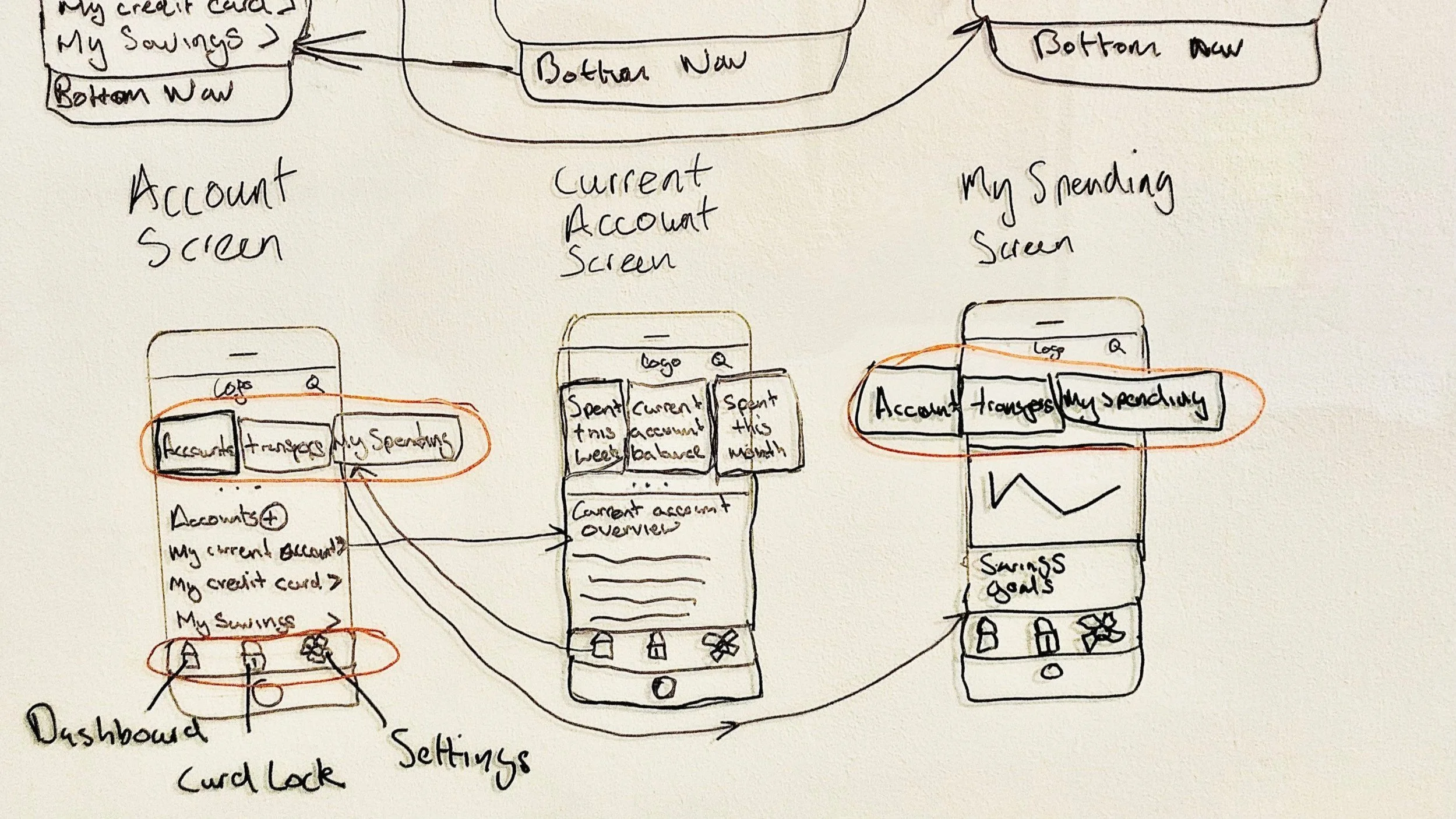
Improving mobile navigation by implementing a user-friendly bottom menu
The existing mobile navigation was heavy and difficult to use.
I proposed introducing a bottom navigation bar, inspired by a Smashing Magazine article showing its ergonomic benefits on large screens.
At first, the idea met resistance for breaking convention, but after sharing the research, the team supported testing it.
I created prototypes, tested them informally with friends and colleagues, and confirmed smoother navigation using thumbs instead of top-corner hamburger menus.
smashingmagazine Bottom Navigation Pattern On Mobile Web Pages: A Better Alternative?
Securing Stakeholder Approval with Clickable Prototype
We presented a clickable prototype of both desktop and mobile versions, incorporating all approved improvements — simplified navigation, trust-driven homepage content, and enhanced mobile usability. Stakeholders responded positively, approving the design for UI development.
Outcome & Reflection
The project successfully shifted Intravacc’s website from research-centric to customer-centric, supporting clearer communication, stronger trust, and better lead generation potential.
Stakeholders’ enthusiasm validated that the redesign aligned with both business and user goals.
What I learned:
Even without formal user data, structured research and curiosity can uncover genuine user needs.
Emotional mapping and OOUX workshops turn abstract business discussions into tangible design direction.
Building trust online isn’t about decoration — it’s about clarity, transparency, and accessibility.
More Case Studies
-

Fly UX: Increasing Bookings by Simplifying Booking Process (UX)
RESULT: Built and tested a medium-fidelity desktop prototype using research insights to validate key assumptions.
WHAT: Competitive analysis, user testing, affinity diagramming, user journey mapping, user flows, and prototype development.
WHO: The client is a proposed startup airline aiming to create a fast, easy, and intuitive online experience for its target users.
6 minute read
-
Built a trustworthy banking app by blending playfulness with clarity (UI)
RESULT: Created a responsive UI design for three screens, aligned with the client’s brand principles.
WHAT: Developed mood boards, improved the user flow, and designed responsive UI screens based on basic wireframes.
WHO: Proposed responsive UI design for a playful, clear, and trustworthy banking app for a financial challenger brand.
5 minute read