Fly UX: Increasing Bookings by Simplifying Booking Process (UX)
Problem Statement
A startup airline aims to create a flight booking website that offers a fast, easy, and intuitive experience based on a deep understanding of its target users. The challenge is to design a solution that improves on existing airline designs by addressing common usability issues and ensuring a superior and user-centric booking process.
Highlighting Strengths and Weaknesses by Analyzing Major Airline Sites
Competitive Benchmarking
I had three projects to choose from in the UX diploma. I chose the airline startup case study. I often book flights online to visit family. The booking process has always made me anxious because more than often the process was not always easy and clear. So this would be a personal project that I wanted to get right!
I started by choosing four big airline websites. I looked at their homepage, flight searches, and fares. Taking notes I created a benchmark document with comments and screenshots, highlighting strengths with green dots and weaknesses with red dots.
This is what I discovered
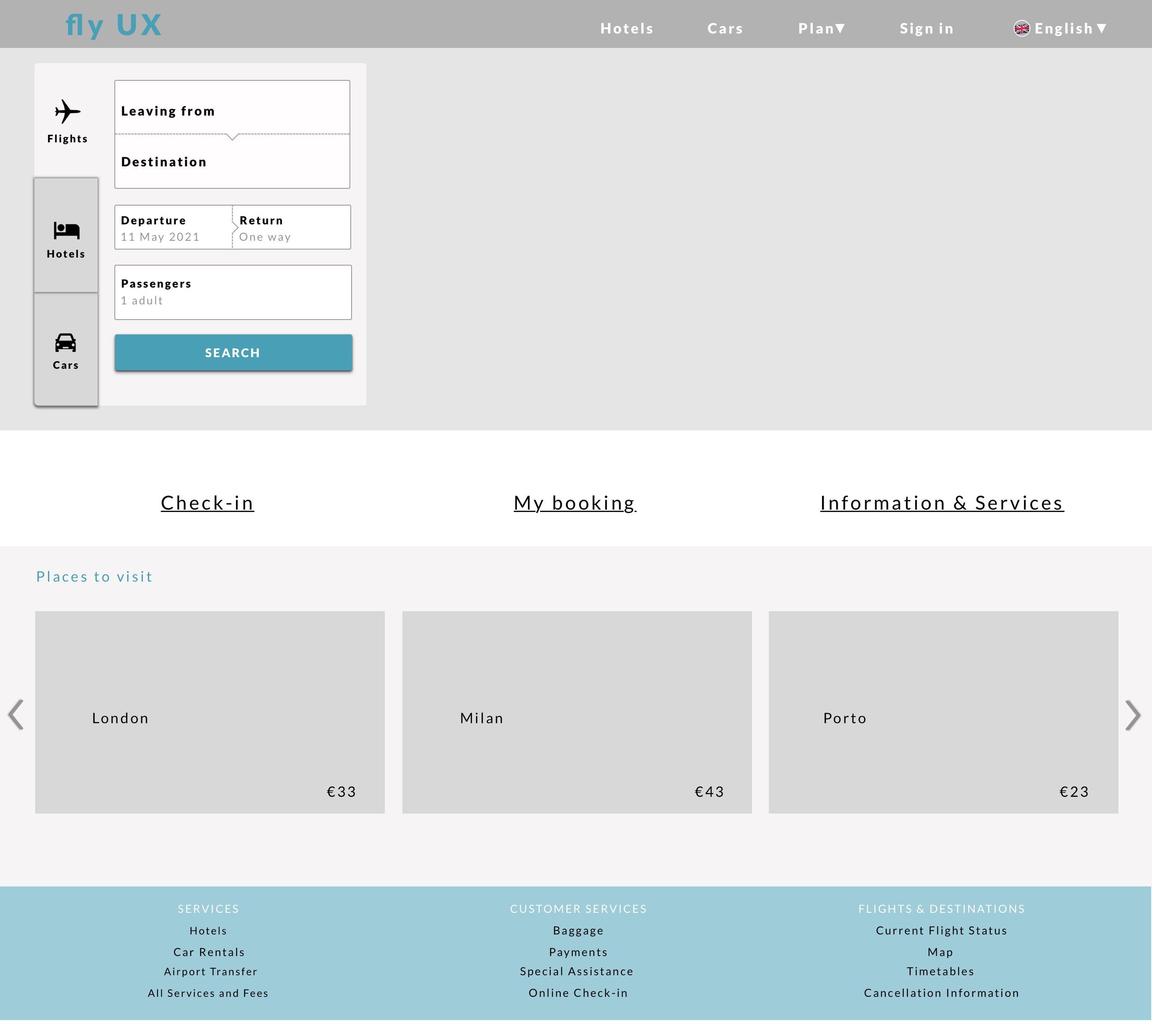
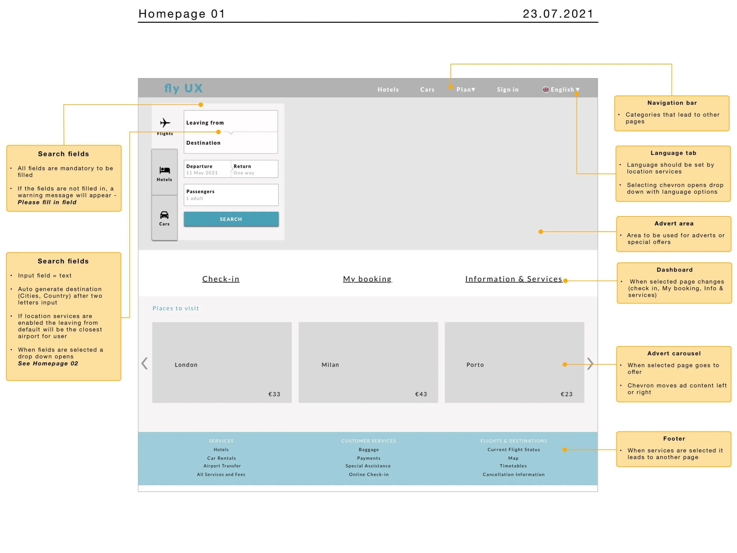
On the homepages, I found that fewer ads make the page easier to comprehend. A clean, simple look works best. It should have important features like Check-in. The Dashboard should be visible at first glance.
The flight search field should be easy to find and should be more about discovery than searching for departure and arrival locations.
Available flight options weren’t always shown in the calendar which slowed down the booking process.
When choosing a fare, An overview slider performed better for comparing flight times and prices.
The buttons for picking flights were not always easy to access. In a few sites, the interactive elements did not look interactive. This was frustrating and made me want to give up.
Uncovering Real-World User Problems Through Usability Testing
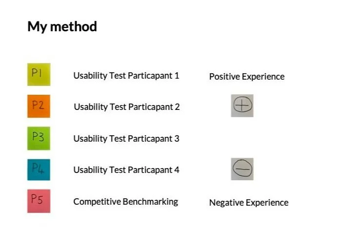
I performed two usability tests and two usability tests were made available by The UX Institute. Finding participants was hard during the second Corona lockdown. So, I relied on close friends who flew often.
After the interview questions, I gave them the task of searching and booking a flight with their own fare and baggage choices. During the test, I asked questions and observed their actions. Later, I studied the recordings and made time-stamped notes.
My initial findings
I learned that even the most tech-savvy people were having problems with the tasks I had given them.
The major roadblocks were noticeable during the flight search and fare selection.
Also, the interactive elements weren't always clear when choosing the flight.
I also saw how stressful the booking was for others which gave me the impression I wasn’t alone in my anxiety when booking flights.
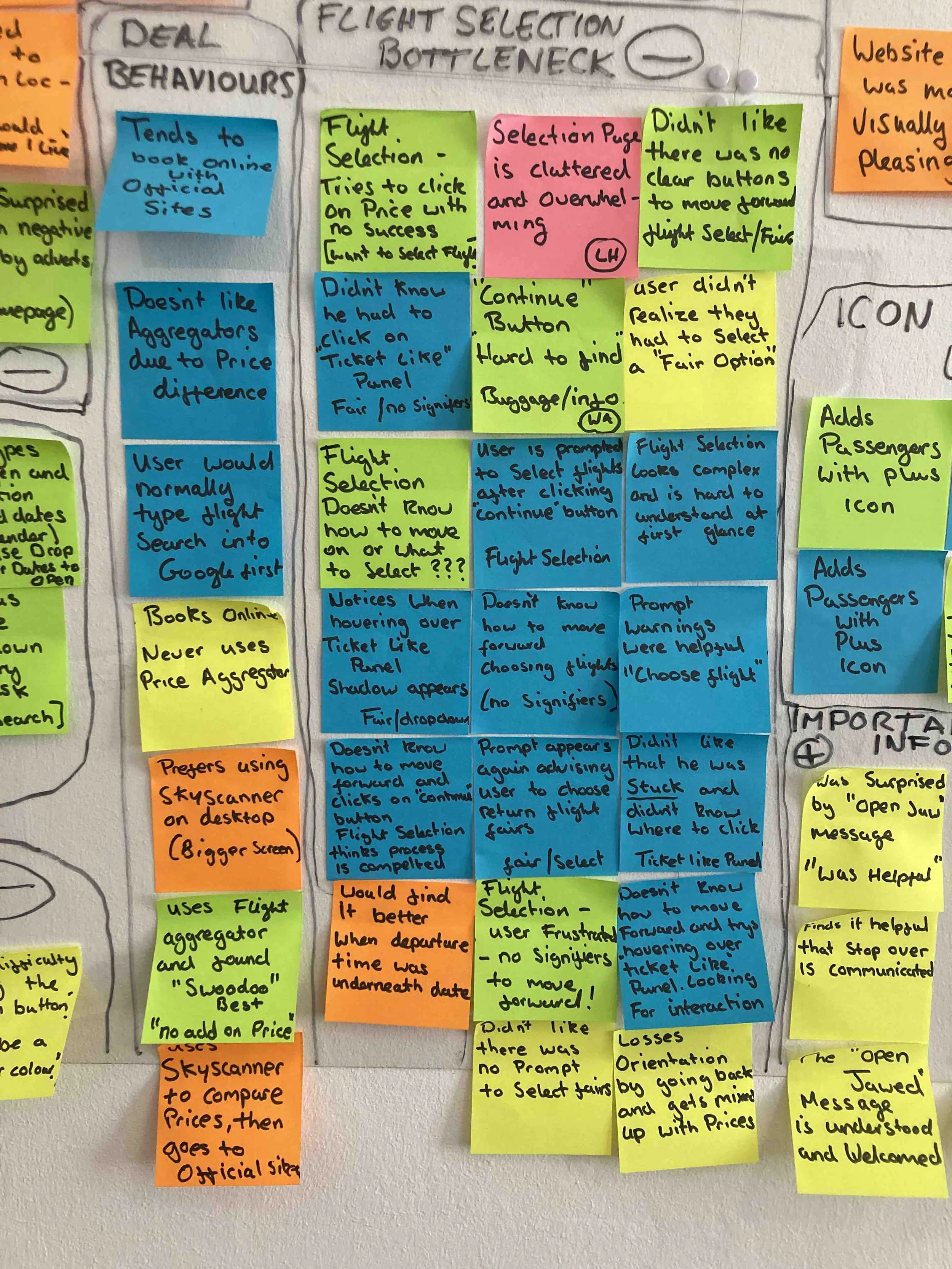
Uncovering Flight Selection Bottlenecks with an Affinity Diagram
We used an Affinity diagram to effectively organize insights from the competitive benchmark and usability tests. While the data initially seemed extensive, I prepared by breaking the research into bite-sized sections in advance, making the session smoother and more manageable.
Pain points
Positives
Goals
Behaviours
I also gave some context as to where in the process these things were happening.
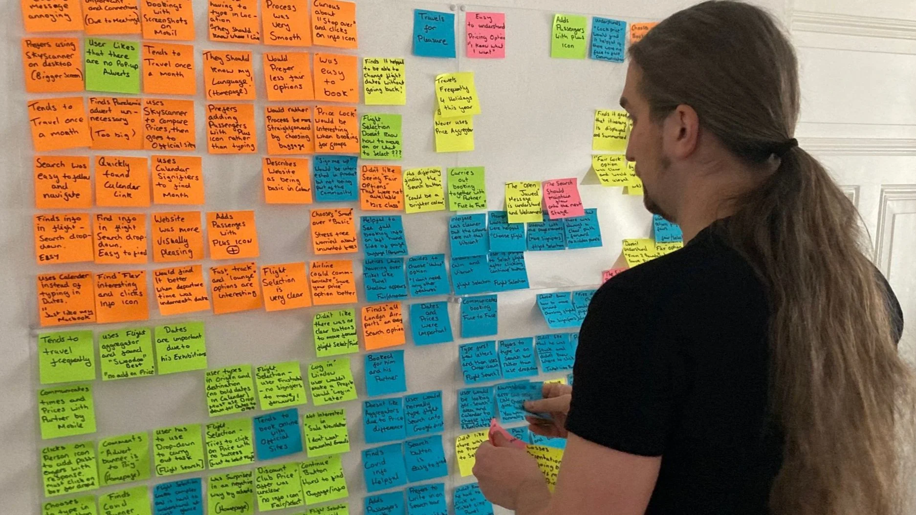
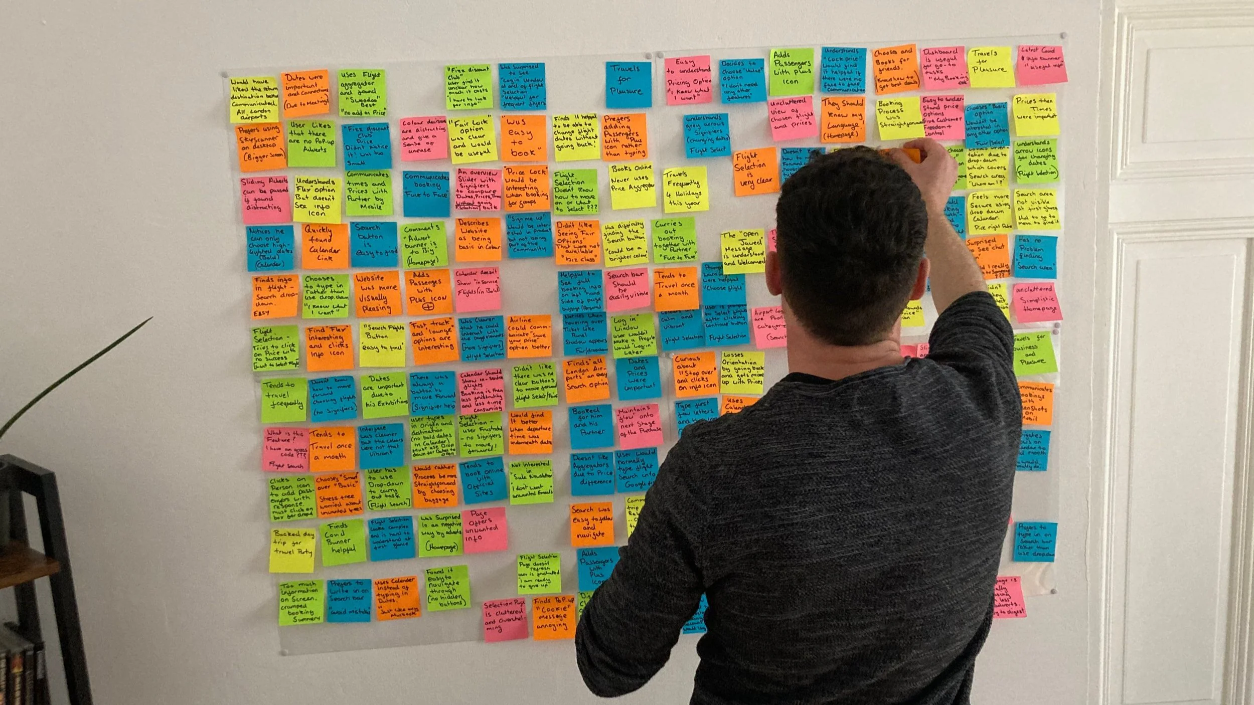
The session was engaging and required focus, and after about 40 minutes, everything started to come together and make sense.
We got to a place where we made groups of post-its and gave those groups names. By doing this we were able to pinpoint key usability issues. We then gave the groups positive and negative groups.
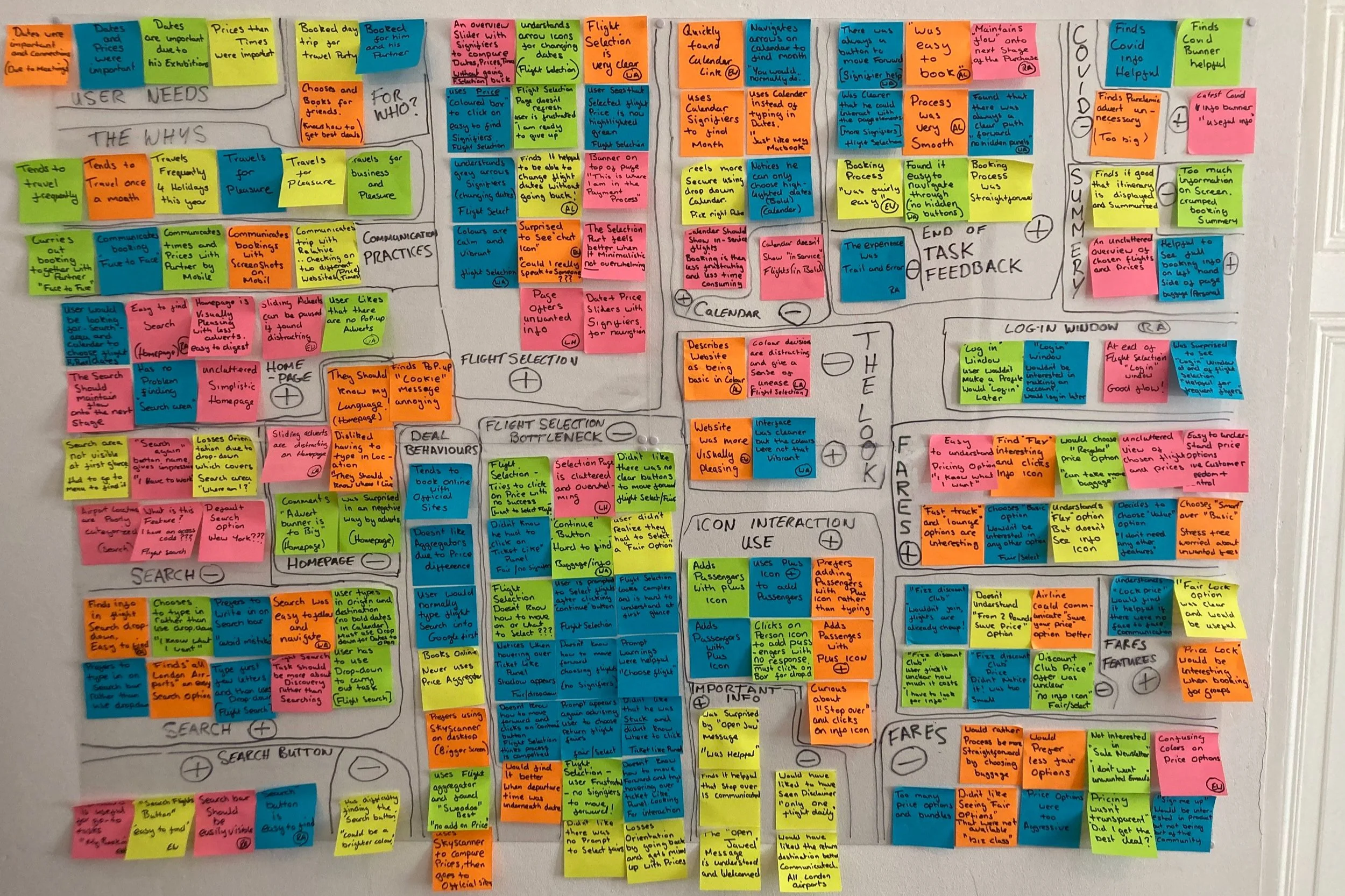
This is what our work uncovered
When users chose to type in search results instead of using the dropdown, it often led to errors.
Users didn’t know how to follow through with the purchase because there were no obvious calls to action on the “Choose a Fare” page the interactive elements were not obvious that they were interactive.
Users didn’t know they had to choose a fare.
They found the flight selection page overwhelming.
Users would normally choose a basic fare and then add more baggage later.
We identified a recurring pattern of issues in the flight selection process, where users struggled to recognize certain interactive elements. We grouped these concerns under the label "Bottleneck," as it aptly described the challenges users faced during this critical stage of the purchase journey. Addressing these pain points was essential for improving both the customer experience and business outcomes.
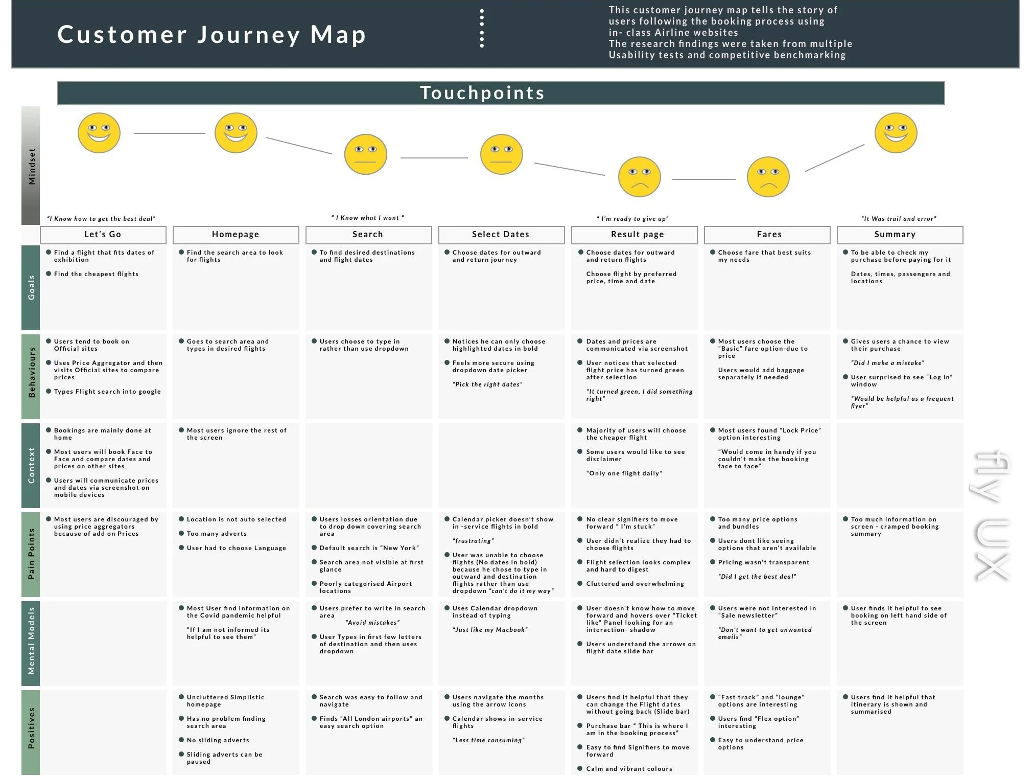
Identifying Booking Pain Points and Solutions with a Customer Journey Map
The customer journey map defines steps in the booking process and corresponds to the groupings of the affinity diagram. For each step, it documents the user's goals, any positive interactions, any pain points, and any behaviours the website did not support.
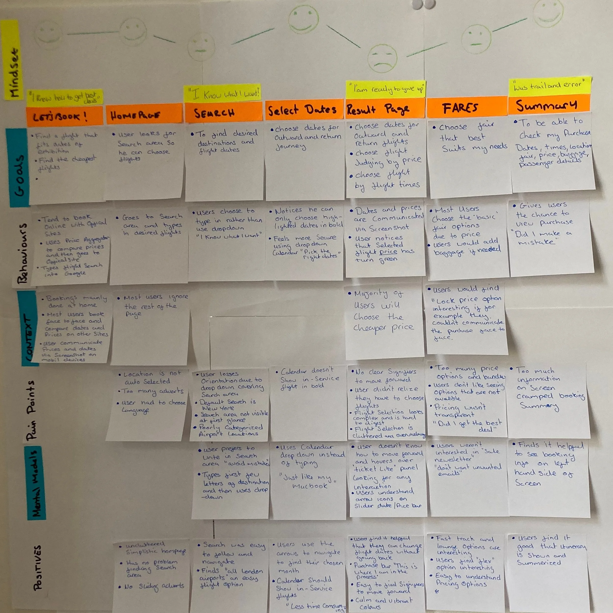
By drawing a smiley face on each step of the user’s journey I was able to convey how that part of the booking process made the customer feel. This also aided the overall scannability of the document.
It was challenging dealing with conflicting data from the Affinity diagram and how that data could be best given a voice in the journey map. Trusting that some data represented the problem, and others helped solve it. Adding a ‘positive’ row helped keep this information together. After translating the research into a rough format, I made a digital document that would be easier to share with team members and Stakeholders. I also added some direct quotes from the customers to help bring the journey map to life.
Improving User Flow by Reducing Booking Friction
To get a feel for the processes and screen states, I went through the steps on an airline website that I thought worked the best overall. This built the framework for the diagram and I implemented the improvements in the user flow from the journey map document.
I booked flights for two people, giving me more creative space to try out different scenarios.
This is what I did to fix the problems
By taking the key pain points from the Customer journey map I made changes to the following issues
Search field, giving the user the choice between using the drop-downs or typing ( This I would also communicate to the developer)
Result page Giving a clear call to action
When choosing a fare, give basic fare customers the chance to add baggage or priority boarding. They can do this while filling out their passenger details.
Using inline validation when a form is not correctly filled out and offering instructions on how to fix any errors
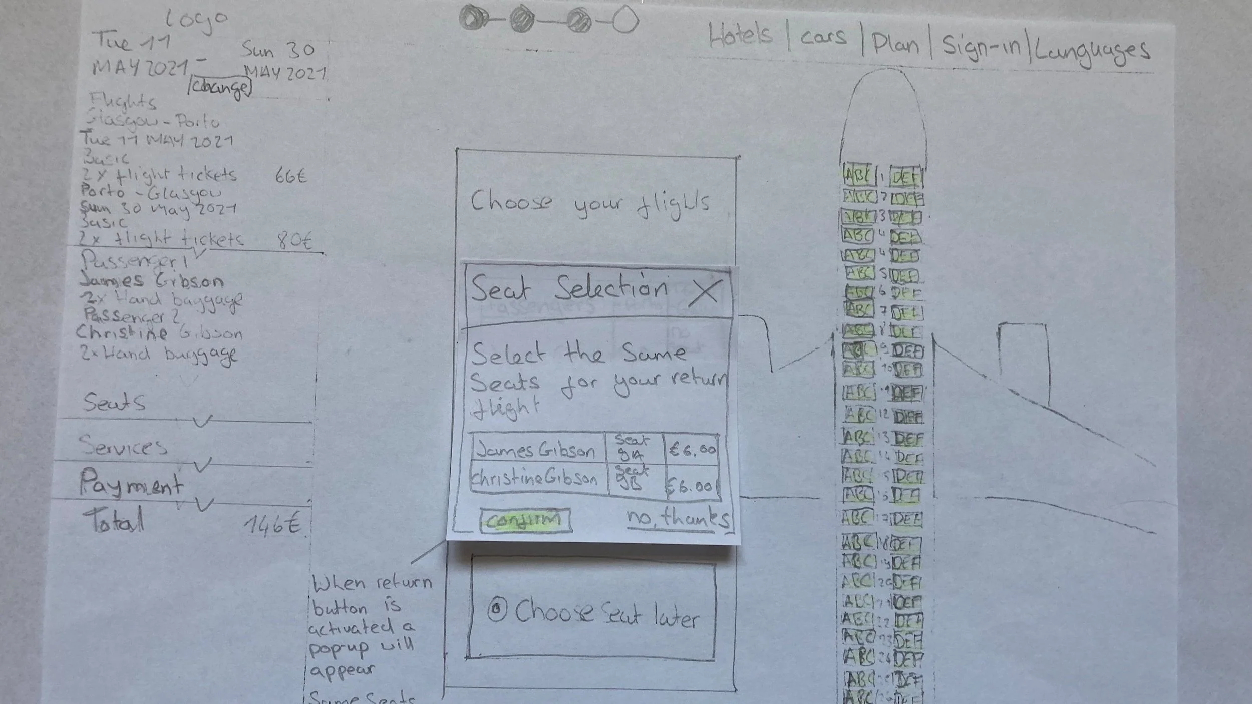
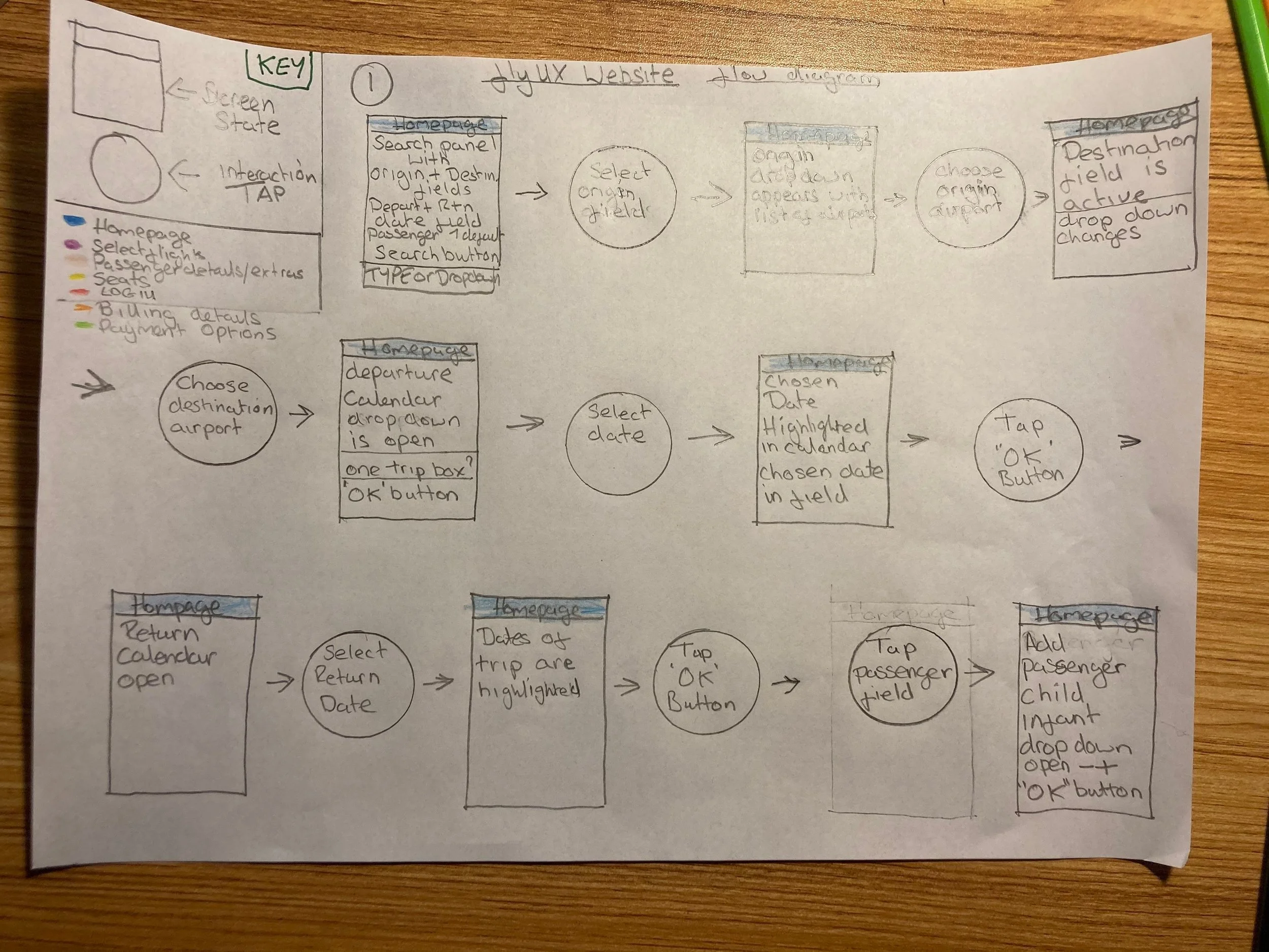
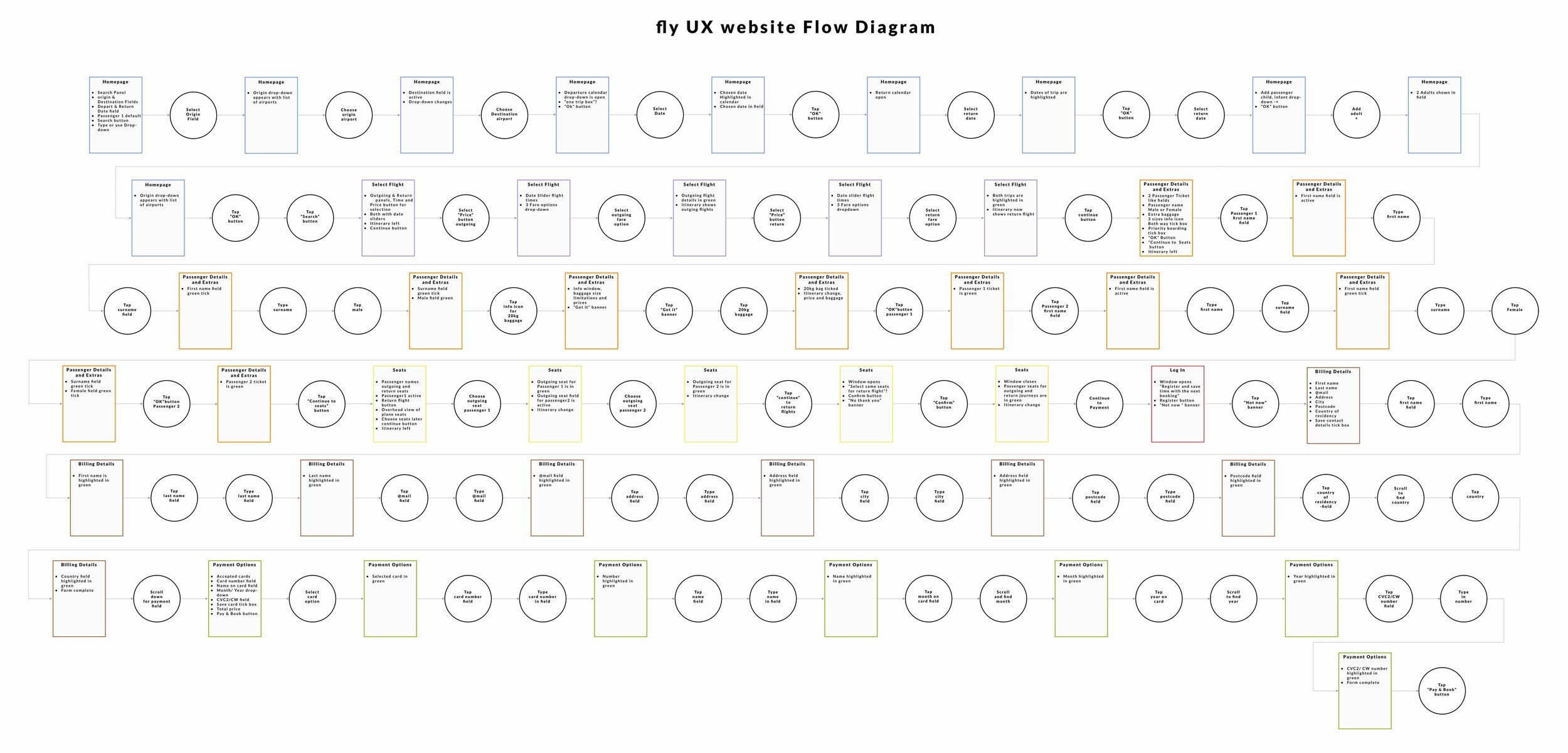
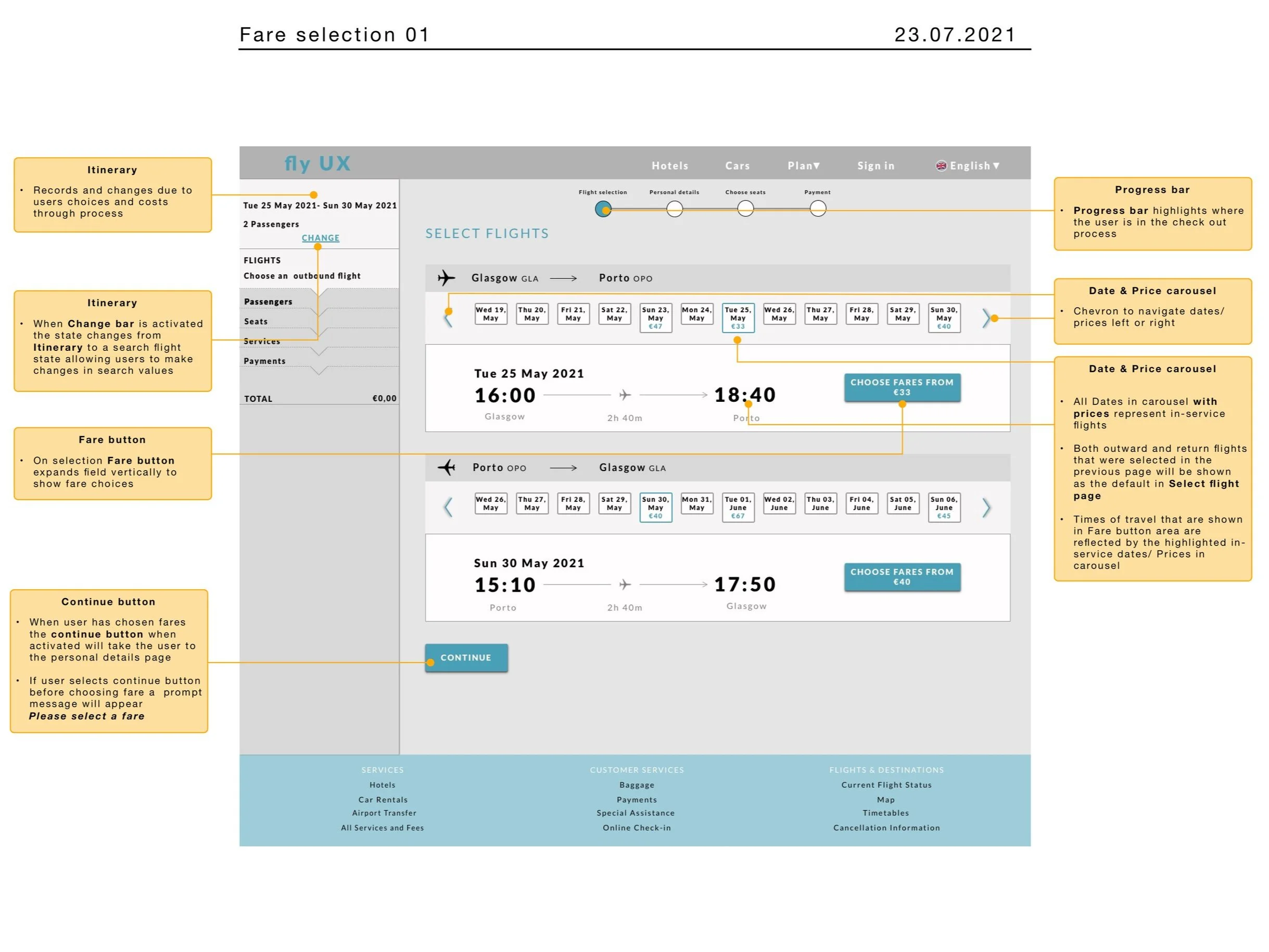
Optimizing Booking Flow by Sketching Critical User Screens
At this point, it was important to imagine what the screens would look like and their different states. This took the thinking part away when it came to building the prototype.
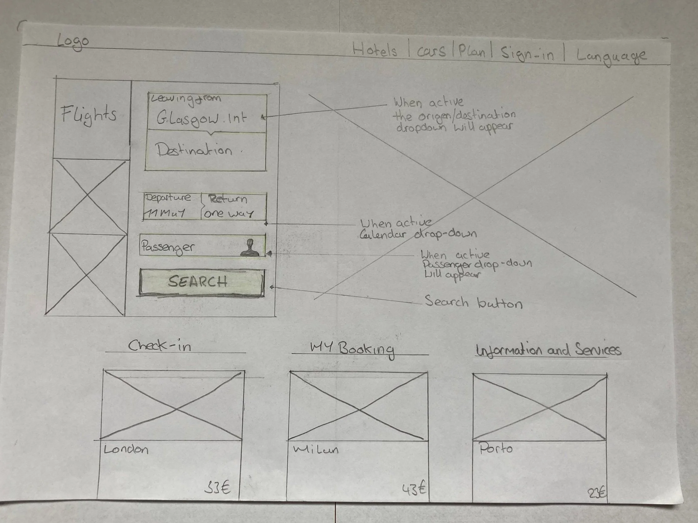
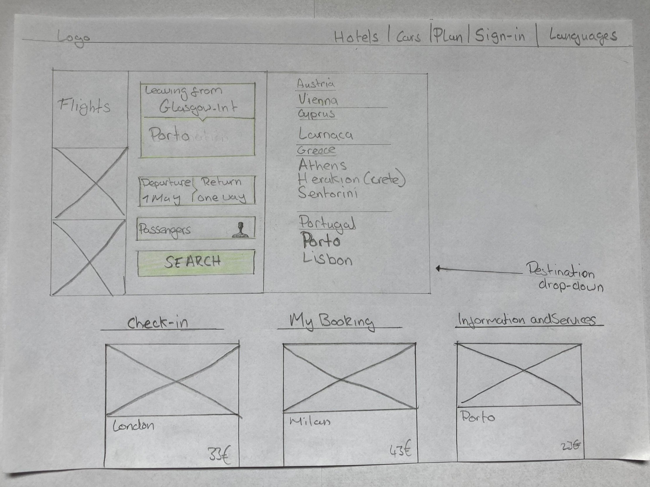
Flight search sketch
I took on some key conventions that were used on other airline websites and chose some screens that worked best on the usability tests. These worked best because they were easy to comprehend and always gave a clear way forward.
In the whole process, I made sure that there was inline validation. This was especially important on the personal details page so people didn’t feel stuck or unsure.
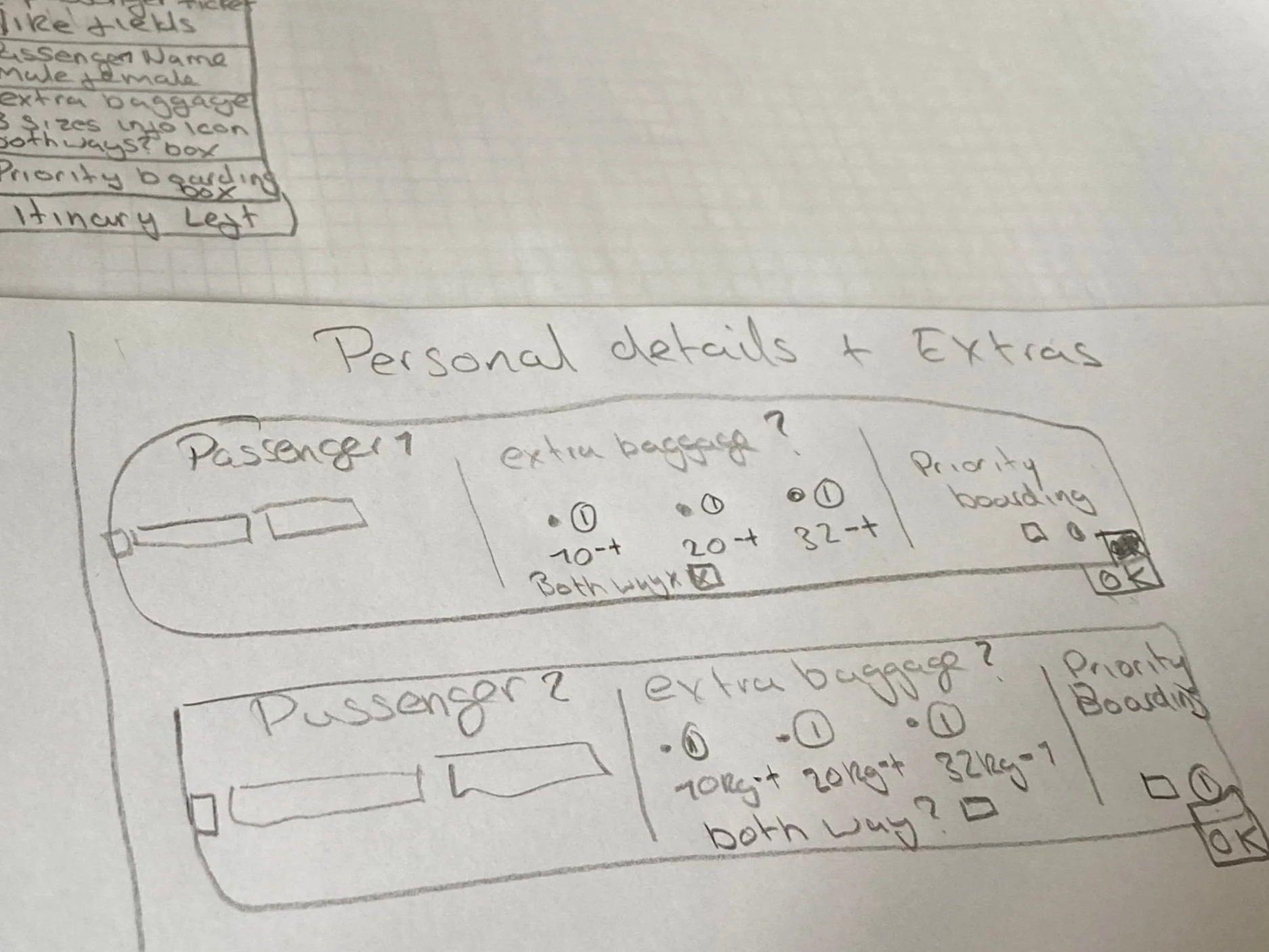
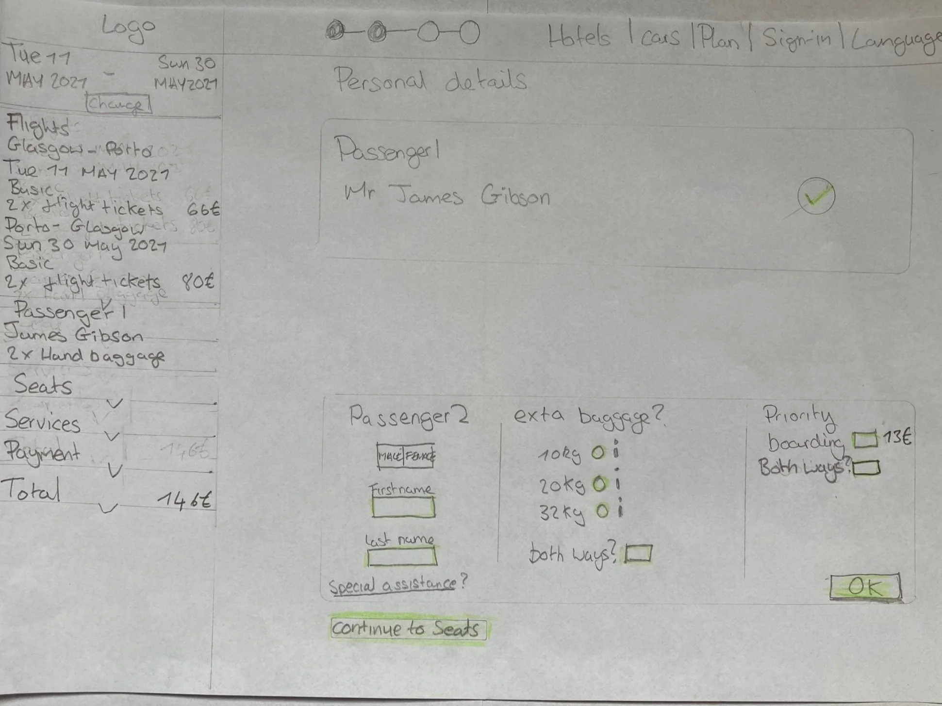
Passenger details sketch
While I was working out the flow diagram, I started sketching out these ideas for the personal details screen. Here I wanted to allow basic fare customers to add baggage or priority boarding whilst filling out their passenger details in the process, I shared my designs with mentors and other students to see if I was creating any dead ends for myself.
Testing the desktop prototype with users
After building the prototype from the search screen to the payment screen I tested it out on three users
This is what I learned
On the Fare page, users found the “choose fair” button easily
Users found it helpful to add baggage while filling out passenger details
The participants were able to flow through the overall process friction-free
Users also commented that the overall experience was easy to follow and intuitive to use
Wireframing to Communicate designs to teams and developers
Solving the search pain point
Here I took care of any existing problem that the prototype was not able to correct or validate. One of these problems was the search field, I set the rule that auto-correct should be used if the customer chooses to type in the input field. This was a key pain point that had to be fixed because users didn’t always use the dropdown menus.
More Case Studies
-
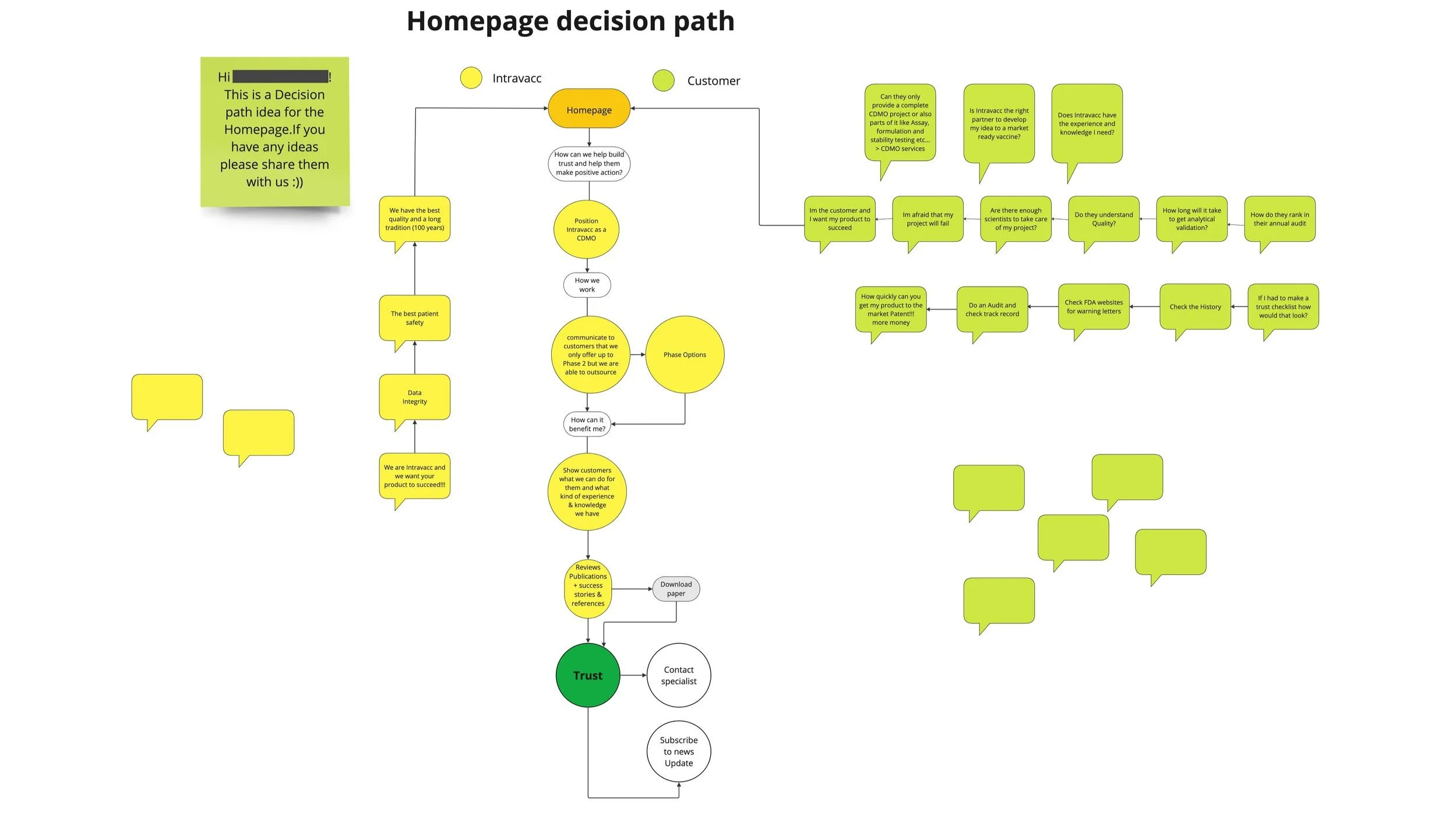
Increasing Intravacc lead generation with website relaunch (UX)
RESULT: Worked with the team to build a website that improved lead generation and clarified Intravacc’s CDMO offering.
WHAT: Competitive analysis, homepage improvement, OOUX, wireframes, prototyping, bottom navigation for mobile.
WHO: Intravacc — a global leader in translational research and development of viral and bacterial vaccines.
7 minute read
-
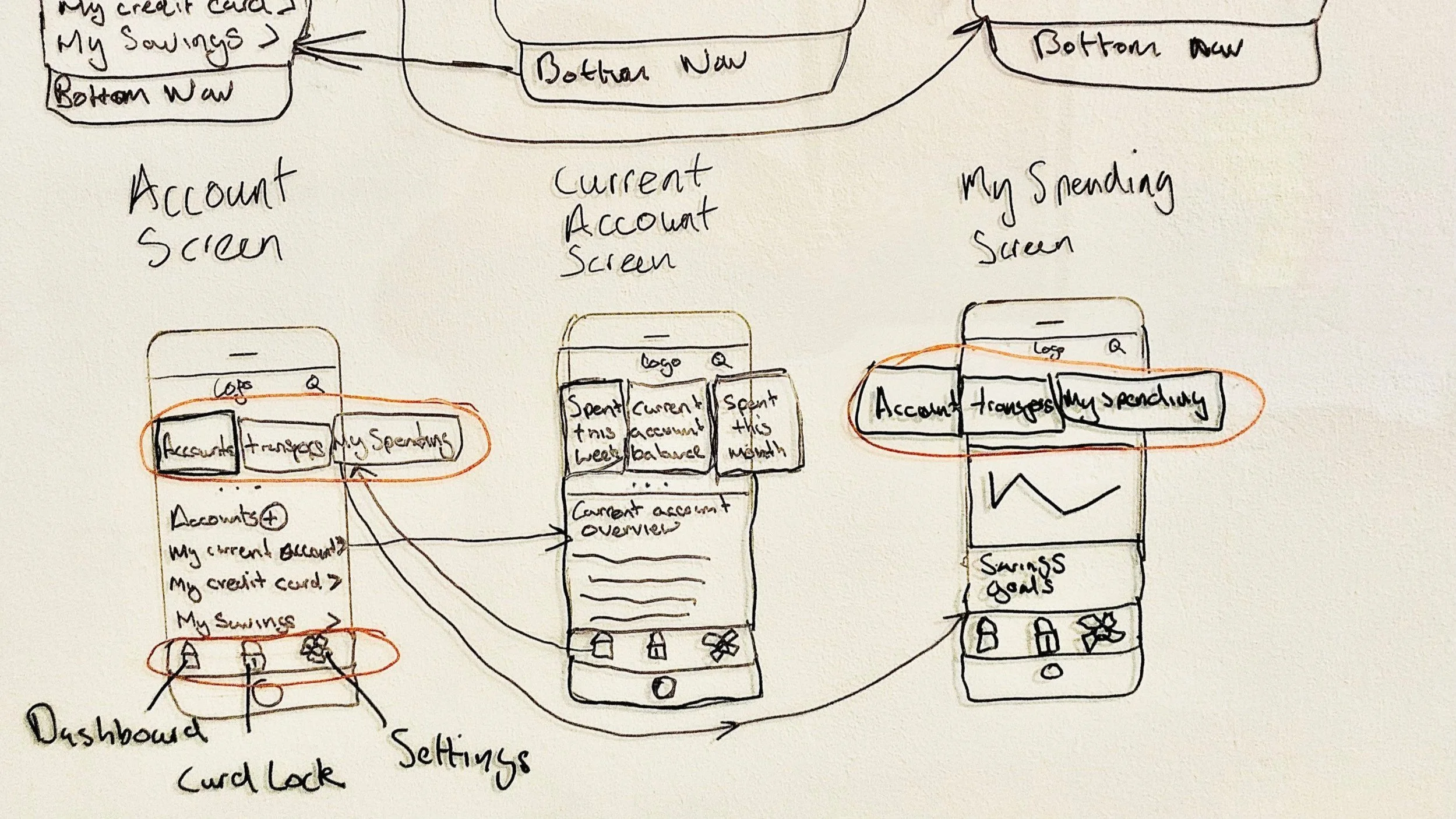
Built a trustworthy banking app by blending playfulness with clarity (UI)
RESULT: Created a responsive UI design for three screens, aligned with the client’s brand principles.
WHAT: Developed mood boards, improved the user flow, and designed responsive UI screens based on basic wireframes.
WHO: Proposed responsive UI design for a playful, clear, and trustworthy banking app for a financial challenger brand.
3 minute read