Designed a trustworthy banking app by blending playful design with clarity(UI)
Outcome
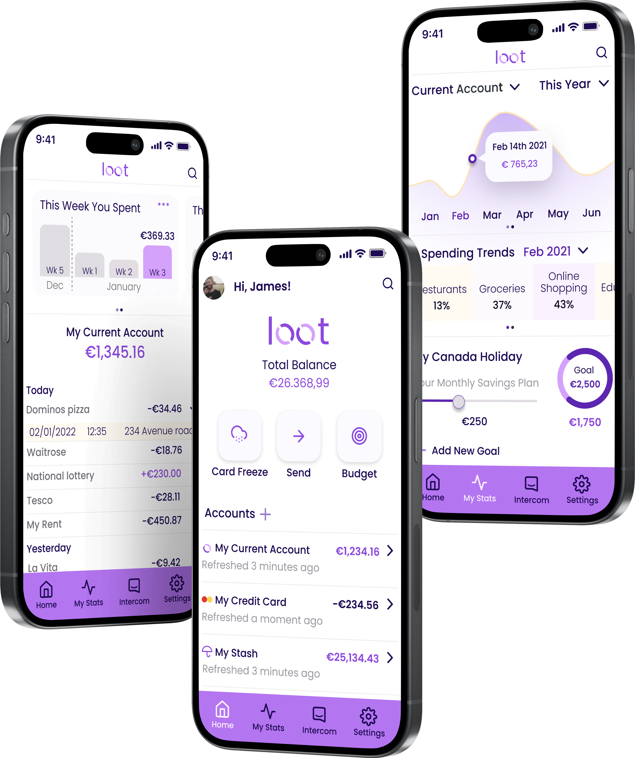
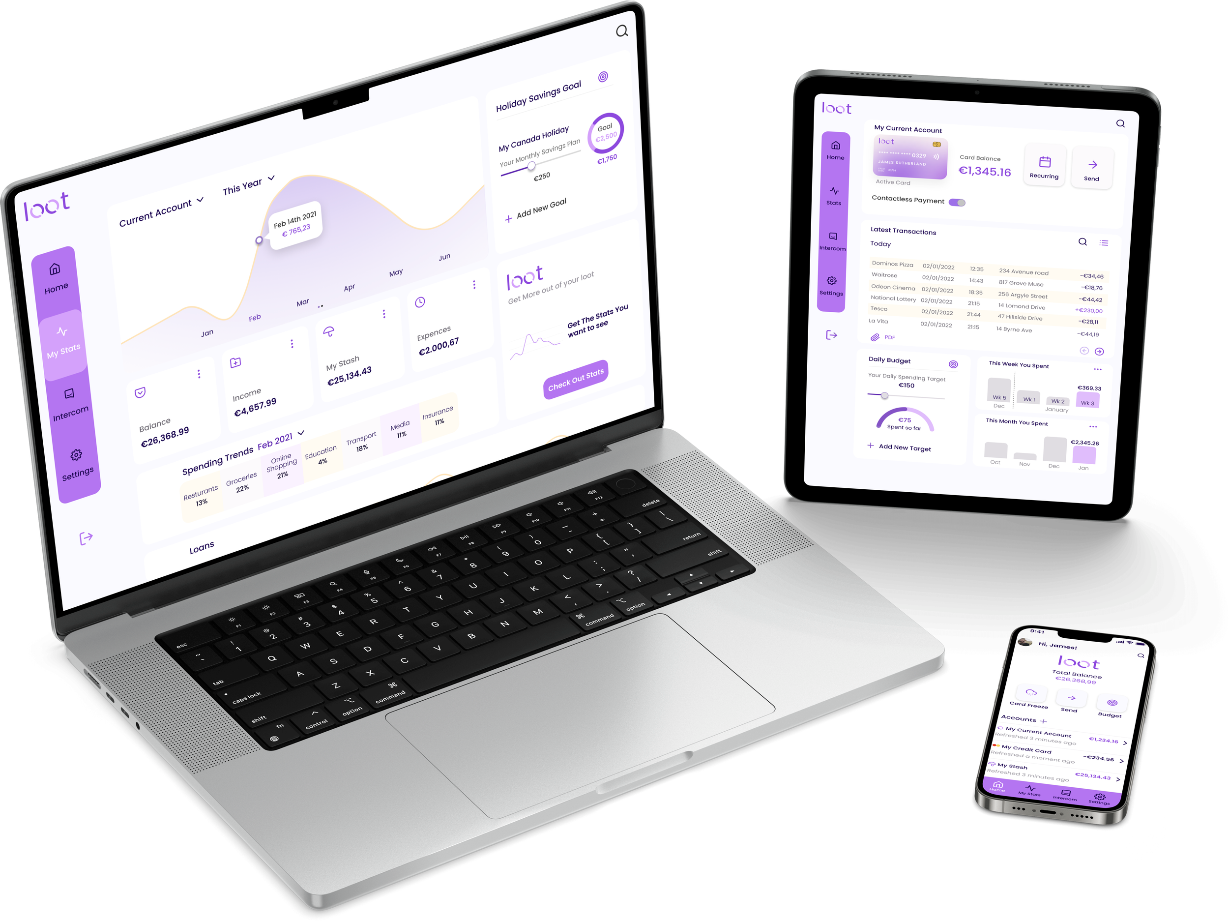
Created a responsive challenger-banking app that balanced playfulness and clarity while maintaining a strong sense of trust.
The final design introduced a thumb-friendly bottom navigation, simplified data visualization for spending insights, and a brand identity that felt approachable yet secure..
Role: UX+UI Designer | Tools: Figma | Duration: 8 Weeks | UI Diploma Project
Project Overview
A new challenger brand in the financial sector needed a responsive banking app that expressed its Clear,Playful, and Trustworthy brand principles.
The challenge was to design a UI that worked seamlessly across desktop, tablet, and mobile, communicating transparency and security without losing the light, engaging personality that defined the brand.
Challenger banks brand principles
Clear
Financial data must be presented logically and without clutter.
Playful
The interface should feel joyful and full of personality through color, motion, and shape, never at the expense of usability.
Trustworthy
Users must feel confident and safe while managing their money.
Finding brand principle value in Brainstorming analysis
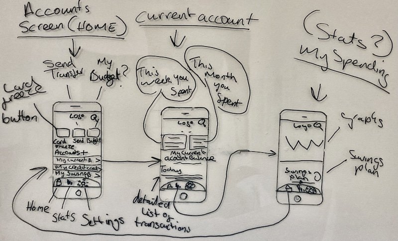
Basic Mobile Wireframes
Working out a better alternative to dashboard idea with sketching
I began by exploring how these principles could be expressed visually and interactively.
Through sketching and rapid wireframing, I focused on the mobile experience first, since clarity and reachability are most tested on small screens.
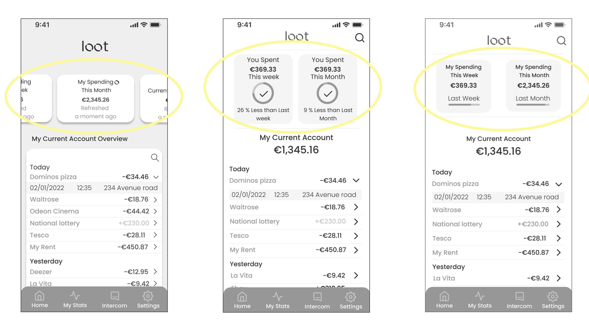
Dashboard rethink: My early dashboard design introduced a second layer of navigation that risked confusing users.
I replaced it with direct-access buttons on the home screen.
This reduced cognitive load, increased white space, and emphasized key calls-to-action.

To avoid user confusion, I replaced the dashboard concept with buttons. This change freed up significant screen real estate, allowing essential calls to action to be prominently displayed. The change made core functions reachable with one thumb, simpler, faster, and aligned with mobile ergonomics.

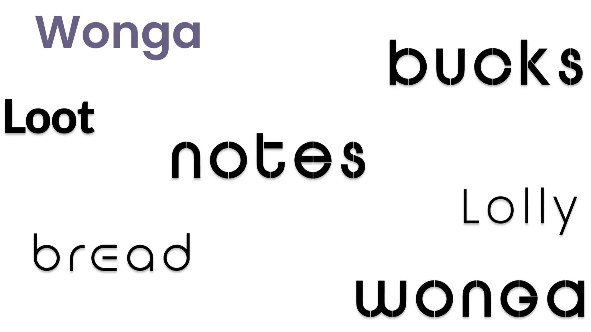
Brainstorming slang names for “Money” to find a logo
To match the brand’s playful tone, I brainstormed slang terms for money.
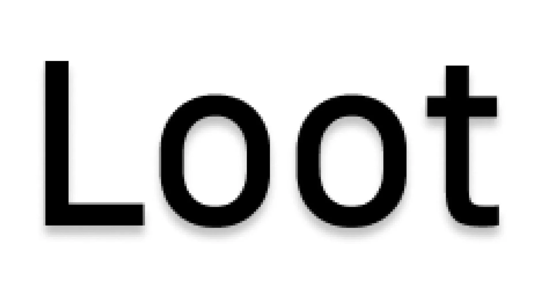
“Loot” stood out for its positive, treasure-like imagery, though I was cautious of negative connotations.
I shared the idea with peers and mentors on Slack to validate assumptions.
Feedback confirmed it was memorable and visually versatile—the double Os could animate like coins in motion, reinforcing a sense of movement and reward.
Making the “Spent this week/ month” feature easier to comprehend with iterations
Design Process Overview:
Started with grayscale wireframes to focus purely on information hierarchy and function before adding color or style.
I studied mood boards of existing financial apps to identify clear visual communication patterns.
Objective:
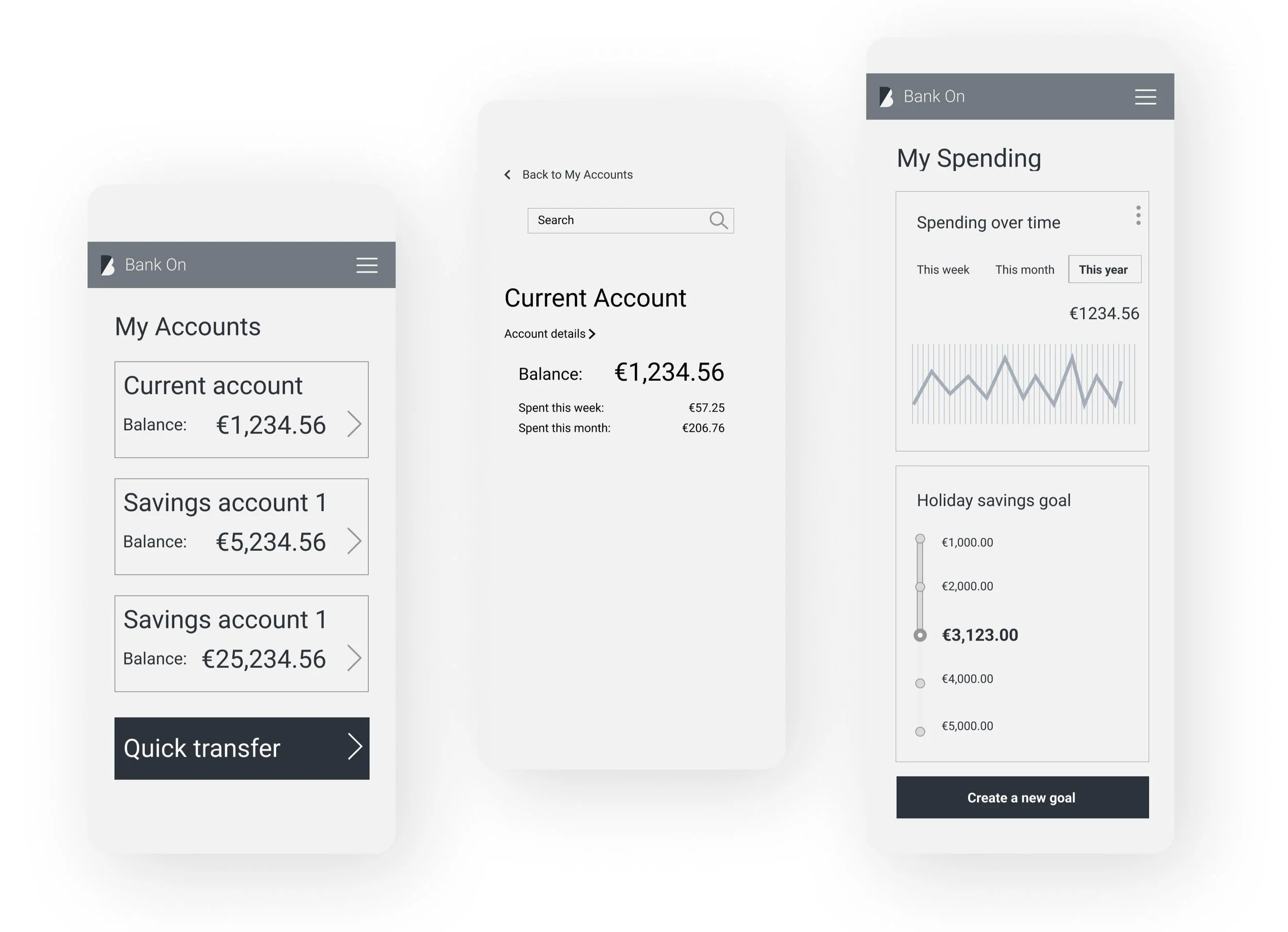
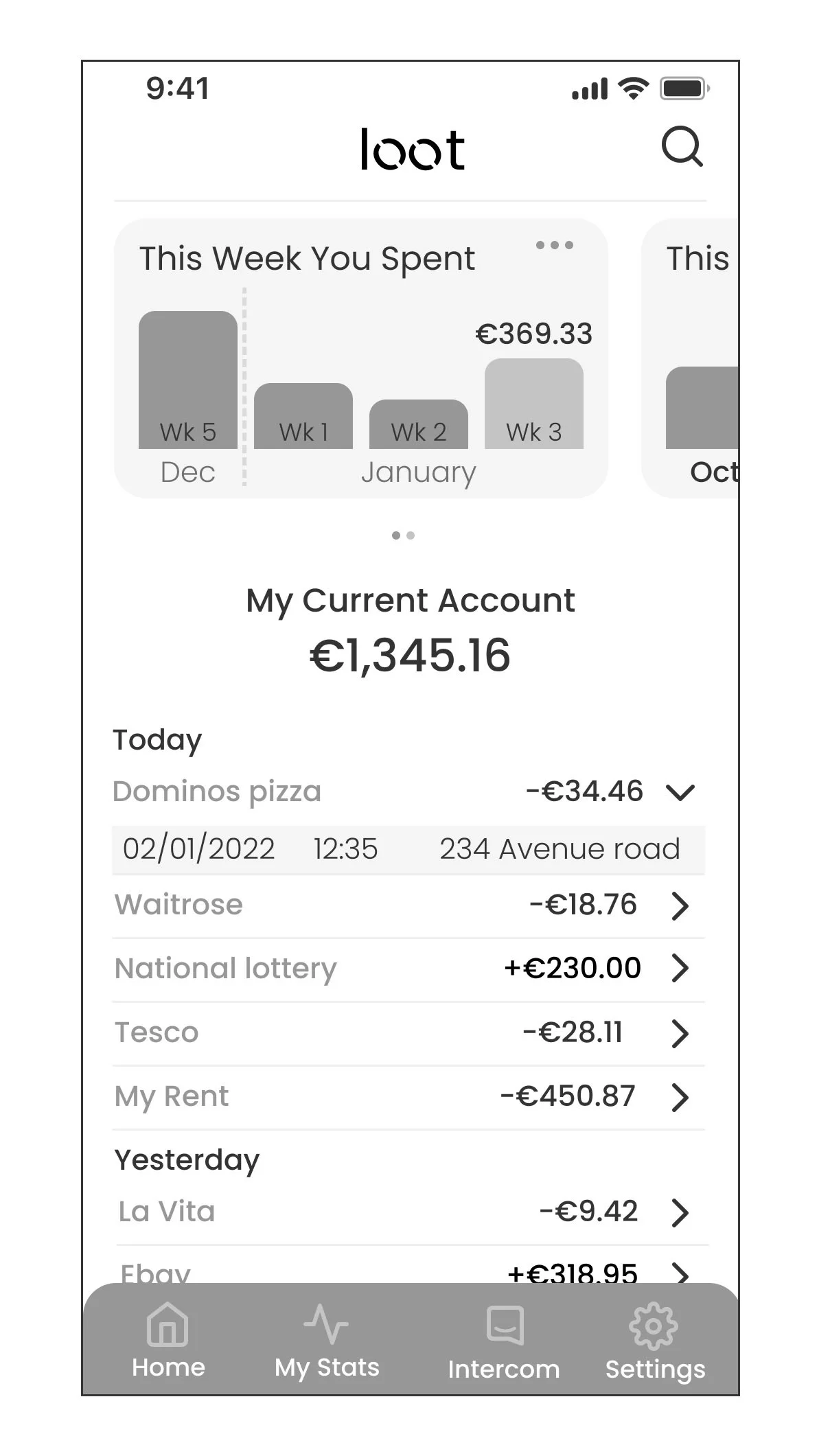
For the current account screen, my primary goal was to present spending information in a way that was both intuitive and informative. I wanted users to easily grasp their spending patterns on a weekly and monthly basis, with an emphasis on data clarity and user engagement.
Design Solution:
I determined that a graph-like representation of spending would be the most effective way to communicate financial data. This visual format not only provides an at-a-glance overview of current spending but also allows users to track their spending trends over time.
Key Decisions:
Graph Representation:
I chose a graph to visually represent spending across weeks and months, as it offers a clear and intuitive understanding of trends. Users can easily compare different time periods without the need for extensive numerical data.Minimalist Approach:
To minimize visual clutter and maintain a clean interface, I opted not to display the exact sum of money spent each week on the graph itself. This decision was driven by the desire to keep the interface streamlined and focused on trends rather than specific figures.
Result:
The design presented spending data that was immediate, scannable, and enjoyable to interact with—merging usability with brand personality.
Bringing the Loot Banking app to life
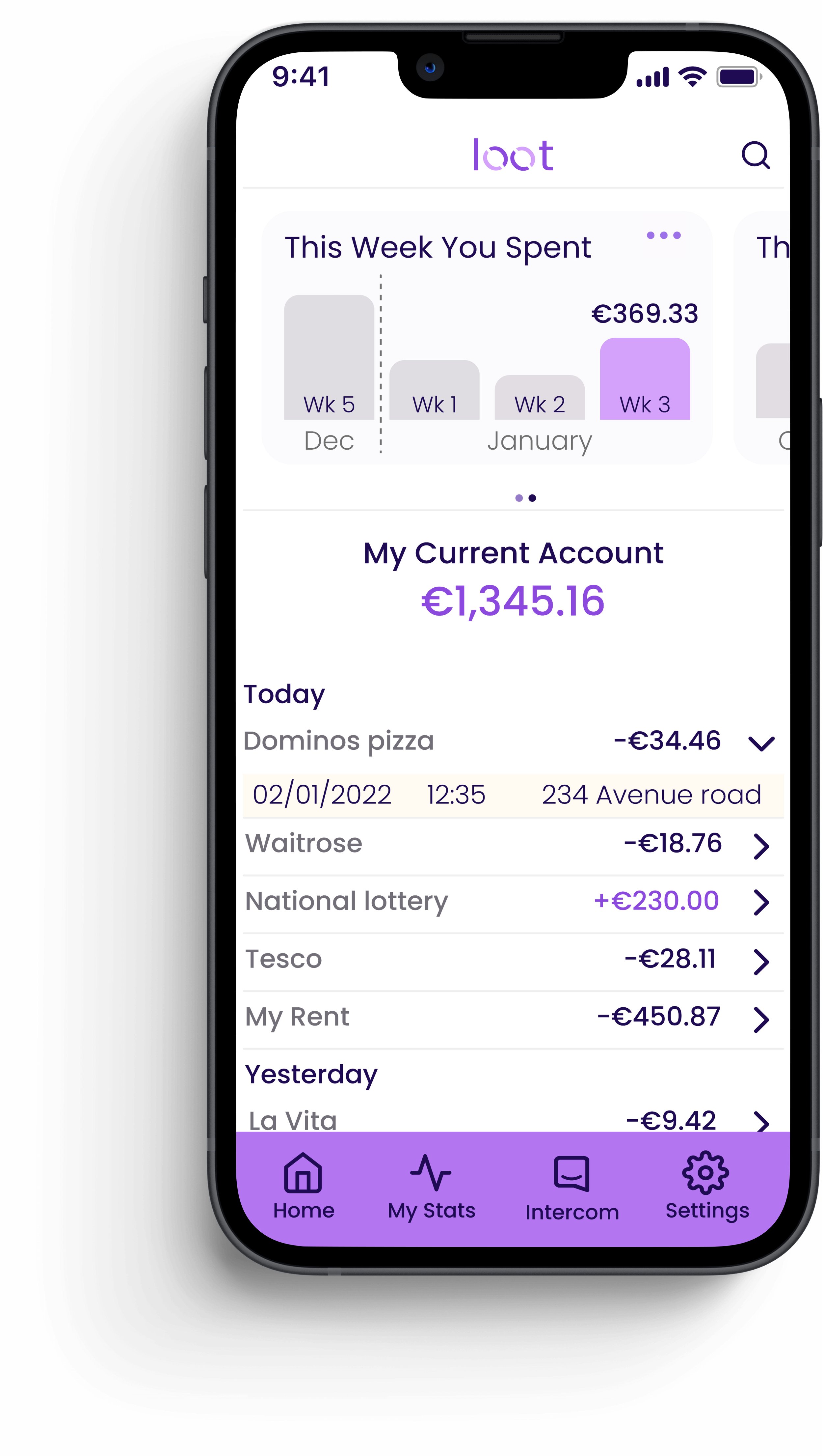
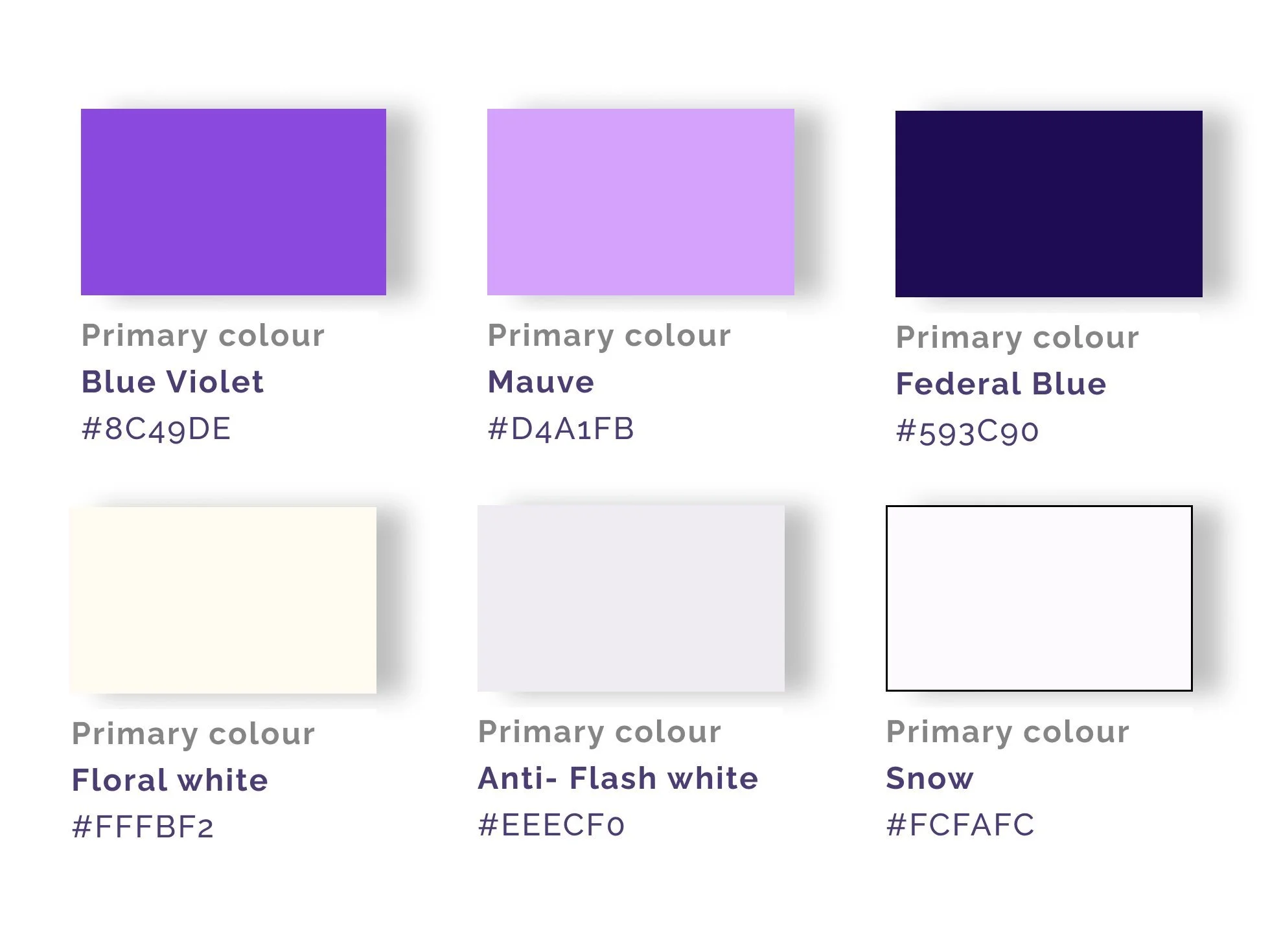
Colour
A vibrant purple palette symbolized wealth and optimism while soft gradients added warmth and energy.
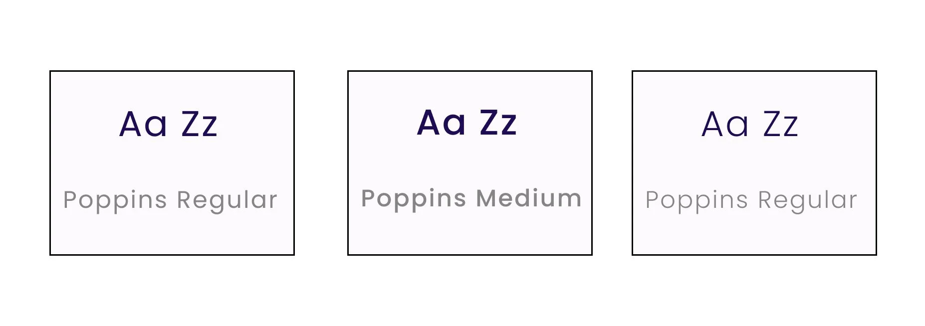
Typography - Poppins
Poppins was chosen for its geometric clarity and friendliness—a perfect balance of playfulness and professionalism, enhancing readability in dense data views.
Loot-Mobile screens
Loot as responsive app
More Case Studies
-
Increasing Intravacc lead generation with website relaunch (UX)
RESULT: Worked with the team to build a website that improved lead generation and clarified Intravacc’s CDMO offering.
WHAT: Competitive analysis, homepage improvement, OOUX, wireframes, prototyping, bottom navigation for mobile.
WHO: Intravacc — a global leader in translational research and development of viral and bacterial vaccines.
7 minute read
-

Fly UX: Increasing Bookings by Simplifying Booking Process (UX)
RESULT: Built and tested a medium-fidelity desktop prototype using research insights to validate key assumptions.
WHAT: Competitive analysis, user testing, affinity diagramming, user journey mapping, user flows, and prototype development.
WHO: The client is a proposed startup airline aiming to create a fast, easy, and intuitive online experience for its target users.
6 minute read