Increasing Intravacc Lead Generation with Website Relaunch(UX)
Outcome
We redesigned Intravacc’s website and CMS to position the company as a Contract Development and Manufacturing Organization (CDMO) and strengthen lead generation.
The final clickable prototype featured improved navigation, trust-driven homepage content, and mobile-friendly design patterns — all approved by stakeholders for UI implementation.
Role: UX Designer | Tools: Adobe XD, Miro | Duration: 8 Weeks | UX Diploma Project
Problem statement
We at Intravacc want to redesign our current website and CMS. We feel that the new website should do the following:
Focus on customers’ needs rather than focusing on sharing vaccine knowledge
Create more lead generation for CDMO business
Position Intravacc as a CDMO
Showcase our broad scope of CDMO services
Exploring the Website's Current State: A Post-it Discovery Session
March 2023
With the project go-ahead in place, I was tasked with getting to know the Intravacc website and getting a grasp of the language and complexity of the pages. To get the full picture I stuck post-its on the wall that represented the pages of content. I also noted any key usability issues I found when moving through the website so we didn’t repeat them. This uncovered some issues in the navigation where parts of the navigation were hidden in a sub-navigation dropdown making pages harder to find.
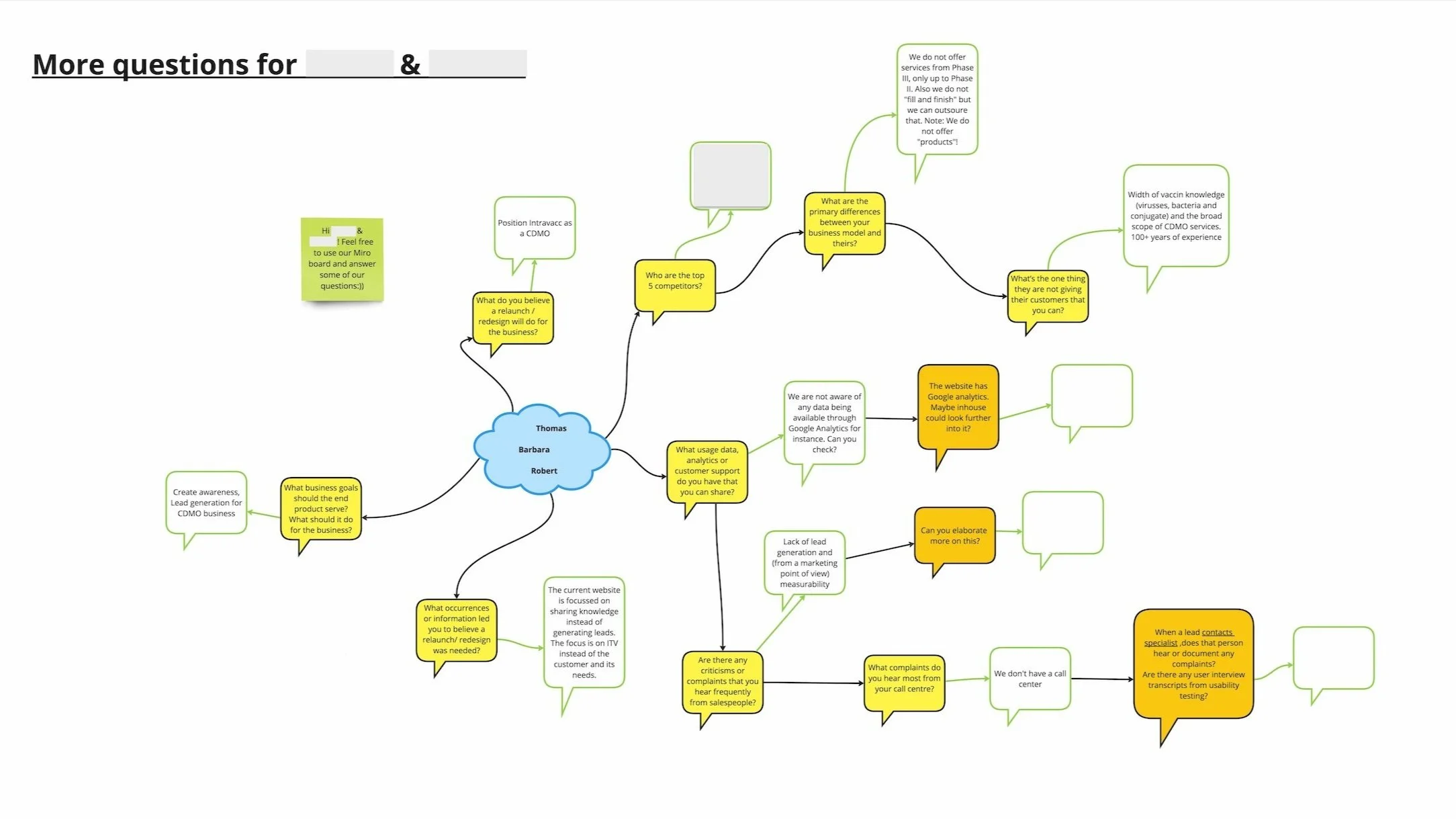
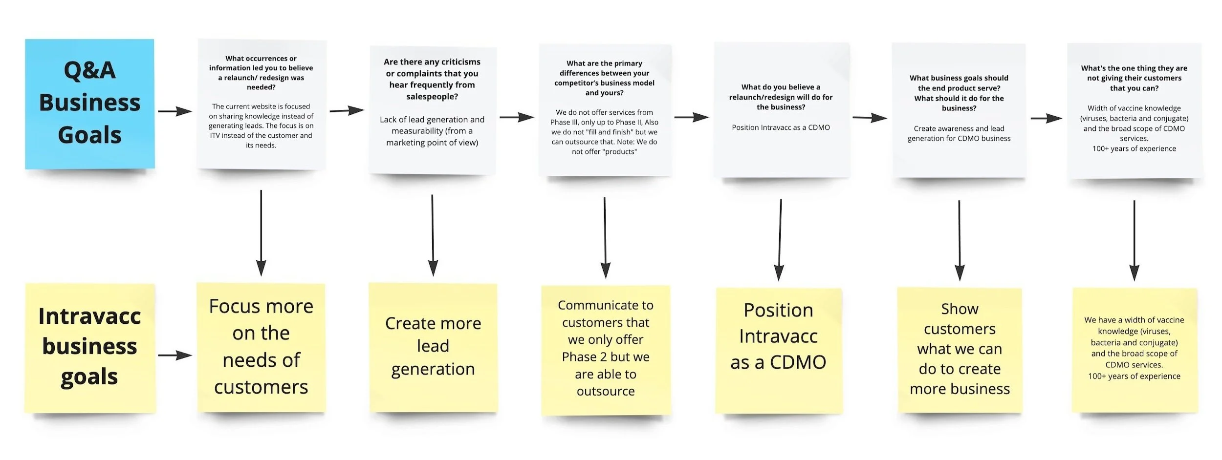
Collaborating with Stakeholders via Miro to Define Business Goals and Guide the Redesign
At our first microsoft teams kickoff meeting, we met the Vice President of Business Development and marketing and the marketing and communications manager. It was a productive session during which our team suggested utilising Miro on Teams. This would allow us to pose queries about business and user goals and collaborate on our ideas.
This uncovered the following business goals.
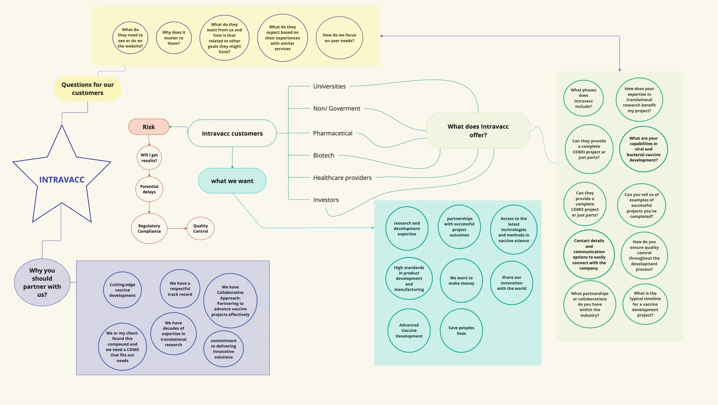
Getting to know a CDMO & their customers with conversations
Understanding the business and its customers was challenging for me and the team because a CDMO has many levels of complexity due to the diversity of services and customers so we immersed ourselves in the information given to us by the product owners.
We also didn’t have any access to any personas or user interviews but luckily we had a content writer on board who had great knowledge of the workings of a CDMO. This was immensely valuable to the team and allowed us to get answers to any queries we had regarding user goals and behaviours.
Understanding how to build trust with customers through podcast research
I spent a week understanding user goals. Even with our content writer's help, it was important for me and the team to get a diversity of information regarding user goals and needs. So, I searched for answers on the Internet and in podcasts with helpful titles like "What to look for in a CDMO." These podcasts were pots of gold. I learned from listening to how a CDMO could build trust with its customers. Here are a few key takeaways I gathered.
Customers were looking for the following:
Clear service descriptions that outline capabilities and expertise.
Proven track record of delivering high-quality products on time.
Product quality and reliability to ensure consistency and safety.
Contact details and communication options to easily connect with the company.
Introducing Emotional Mapping to Spark User-Focused Conversations
During a coffee break, I suggested to the team that an Emotional mapping session could help better understand the users of the site. This was a challenge for the team. But, it was positive because it started a conversation about their views and thoughts on user needs.
I added what I had learned from my research and our conversations on the Miro board and shared it as a mind map.
Improving Intravacc website through competitor analysis
Before the initial kickoff meeting, I checked several potential competitor websites. Yet, the Q&A session we put together on Miro revealed that their top 5 competitors were different from what we expected. This was very valuable.
After analysing their competitors I compiled a document that would be presented to the stakeholders where I gave feedback on my experience with the competitor websites. It was important to define the key ways they were building trust with their customer and how the customers could reach out to the company.
We found the following enhancements could bring the Intravacc website closer to meeting both user expectations and business objectives.
Let the customer book a call with a specialist with the help of –” Calendly” for example.
Offer vertical tags for social media links, Contact links & newsletters (These are always present)
Success stories with images of people- people love success stories (Show what has worked and how failures can be successes)
FAQs Frequently asked questions section may help shorten the time it takes for people to solve their search requirements (also helps with SEO if a similar question is being typed into a search engine)
News articles should show an estimated read time- and give a transparent/ forthcoming experience- People are time-poor.
After receiving positive feedback on the competitive analysis document, we were approved to proceed with implementing the improvements in medium-fidelity wireframes for both desktop and mobile.
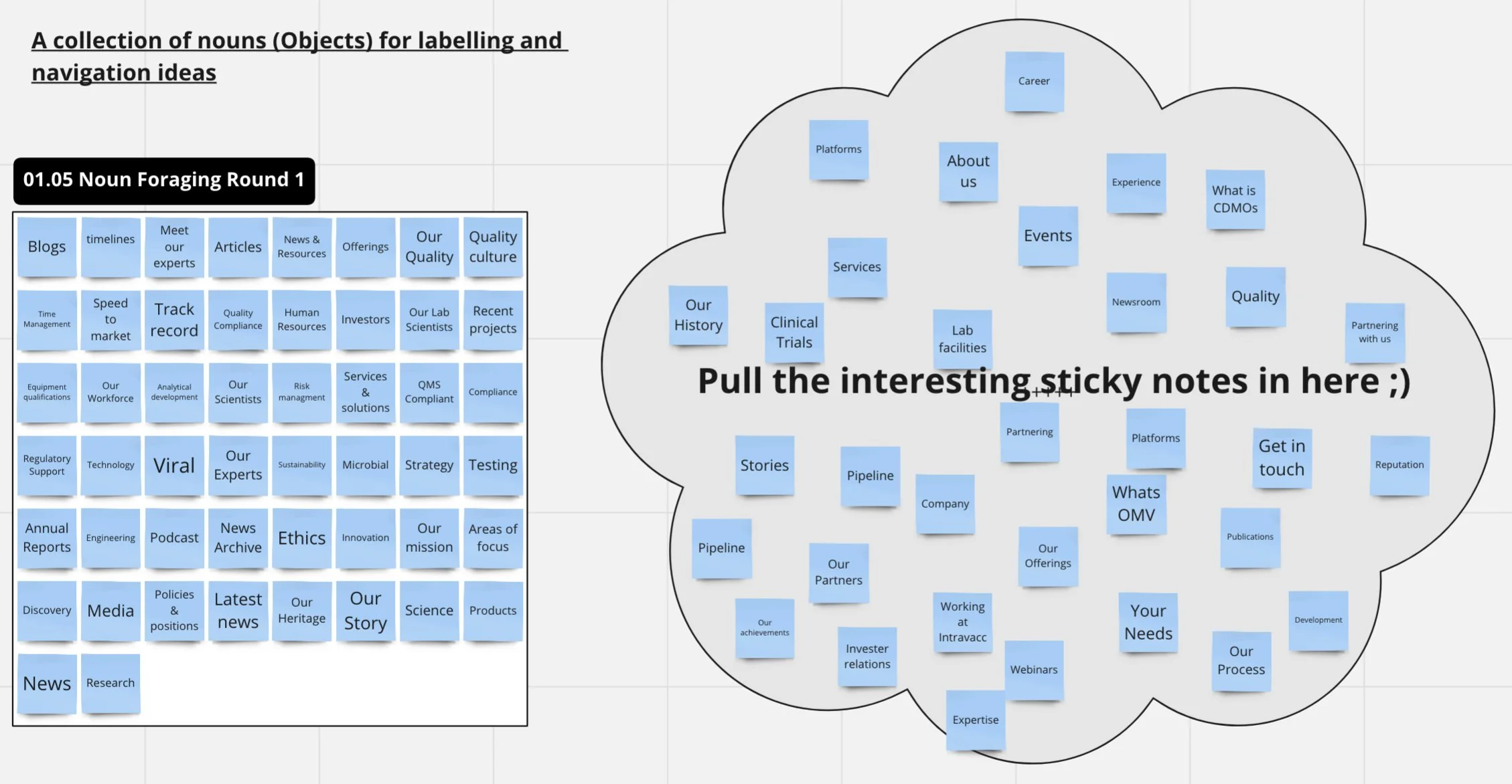
Uncovering stakeholder website labelling preferences through OOUX noun forging
May 2023
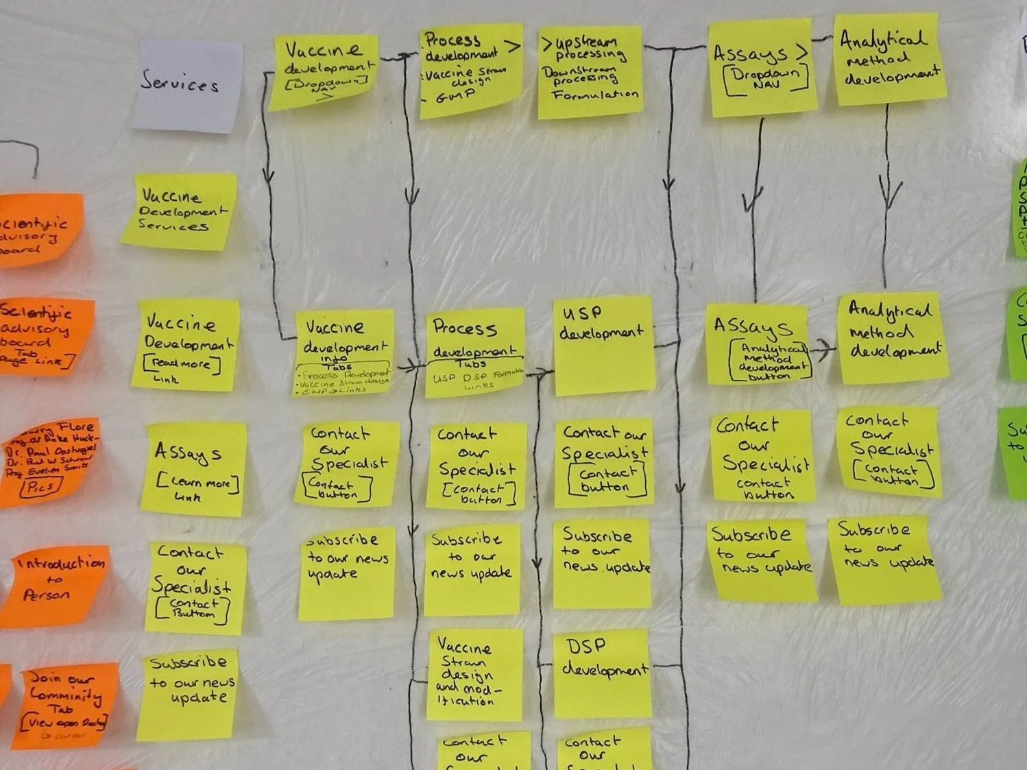
The digital version of the current website sitemap on Miro got the attention of stakeholders. They saw that the website's structure had to change. In the current version, some of the navigation was in a sub-navigation dropdown. This was not user-friendly. Also, some labelling had to be made easier to understand. The UI designer and I were tasked with fleshing out the navigation and reorganizing it. We aimed to make the navigation lighter and easier to comprehend. I introduced the noun forging part of “Object-oriented UX” to help with the task of labelling.
I transferred the labelling examples, I had seen during my competitive analysis to our Miro board and invited the stakeholders to drag the Post-its they thought were most valuable into a cloud. By doing this we were able to incorporate the preferred labelling in our wireframes.
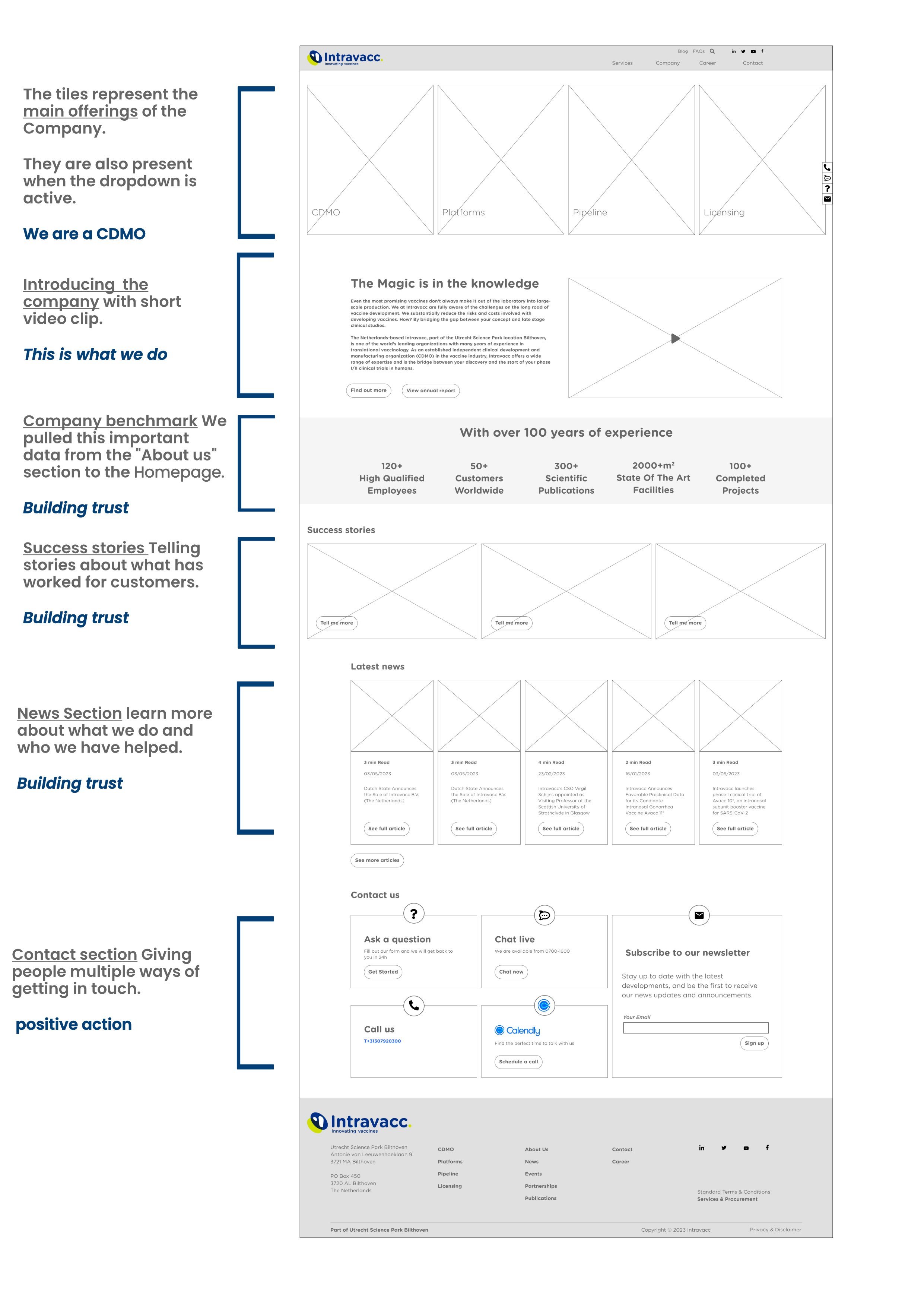
Enhancing CDMO awareness and trust using Research for homepage Decision Path
May 2023
In a team meeting, we discussed our research findings on building trust with the customer and showcasing Intravacc as a CDMO business on the homepage. We used a decision path to reflect the journey the user would make through the homepage.
We wanted to establish trust so they would take positive action. In this case, positive action meant them getting in contact with a specialist or subscribing to the newsletter.
This was when the research fell into place with the competitive analysis document, podcasts, and conversations.
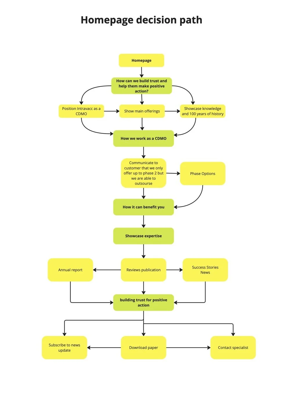
Building the decision path into the Wireframes
June 2023
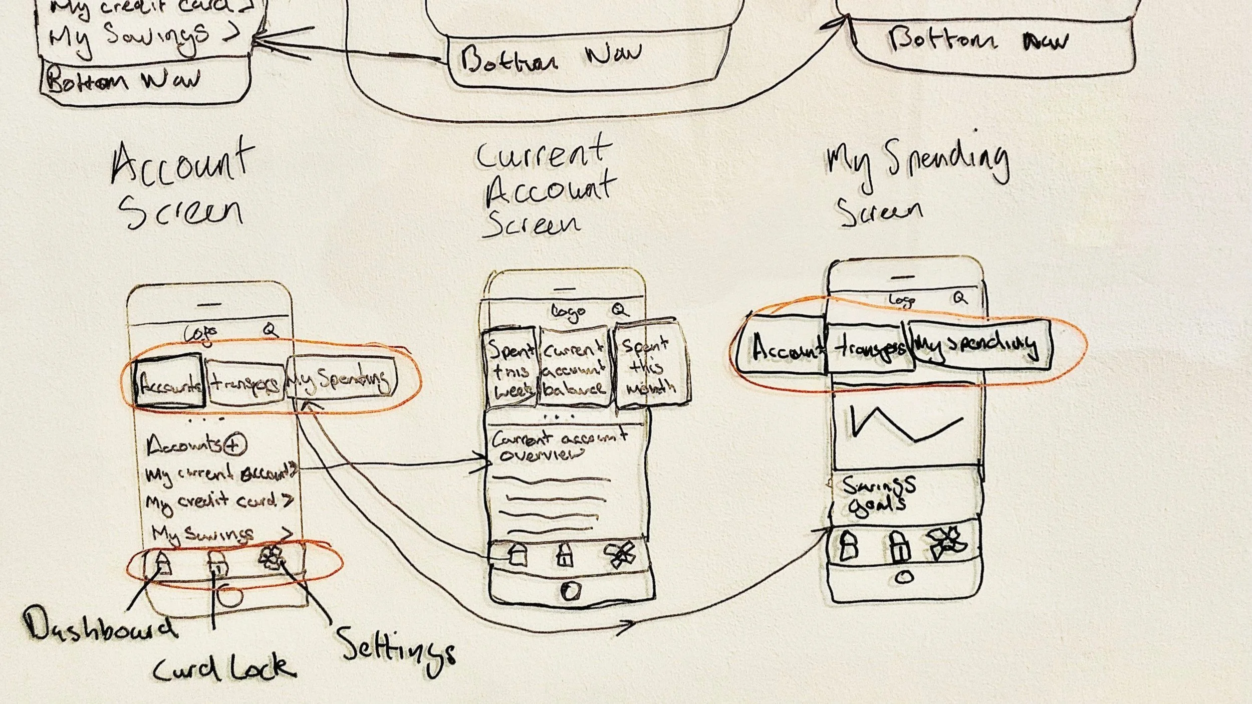
Improving mobile navigation by implementing a user-friendly bottom menu
The mobile version's heavy navigation led us to find ways of making it as user-friendly as possible.
With that in mind, I presented an idea from a case study I had read about the positives of bottom navigation on mobile responsive websites. One of which was that mobile screens are getting bigger, and implementing this design would enable the user to move through the navigation easily using their thumb instead of reaching for a hamburger menu on the top of the screen.
At first, the idea was met with pushback for breaking a convention. But, when the team read the case study, I got lots of positive feedback and I was encouraged to try the idea on the mobile wireframes.
I tested the Navigation with friends and colleagues and was satisfied with the results.
smashingmagazine Bottom Navigation Pattern On Mobile Web Pages: A Better Alternative?
Securing Stakeholder Approval with Clickable Prototype
The Team and I presented a clickable prototype of the desktop and mobile versions of the website. In the prototype, we incorporated our improvements from the competitive analysis document. The Team and I explained why they would benefit the company and its customers. The Stakeholders reacted positively to the changes on both desktop and mobile, giving us the go-ahead with the user interface design.
More Case Studies
-

Fly UX: Increasing Bookings by Simplifying Booking Process (UX)
RESULT: Built and tested a medium-fidelity desktop prototype using research insights to validate key assumptions.
WHAT: Competitive analysis, user testing, affinity diagramming, user journey mapping, user flows, and prototype development.
WHO: The client is a proposed startup airline aiming to create a fast, easy, and intuitive online experience for its target users.
7 minute read
-
Built a trustworthy banking app by blending playfulness with clarity (UI)
RESULT: Created a responsive UI design for three screens, aligned with the client’s brand principles.
WHAT: Developed mood boards, improved the user flow, and designed responsive UI screens based on basic wireframes.
WHO: Proposed responsive UI design for a playful, clear, and trustworthy banking app for a financial challenger brand.
3 minute read